Other works
designer
I started out in graphic design, a digital focus, but none the less, a hodge podge of design assignments where the main objective was to make something look good and relate to the topic at hand. While these pieces have little to do with UX or UI (some do), they’re important to me none the less and show the breath of my scope.
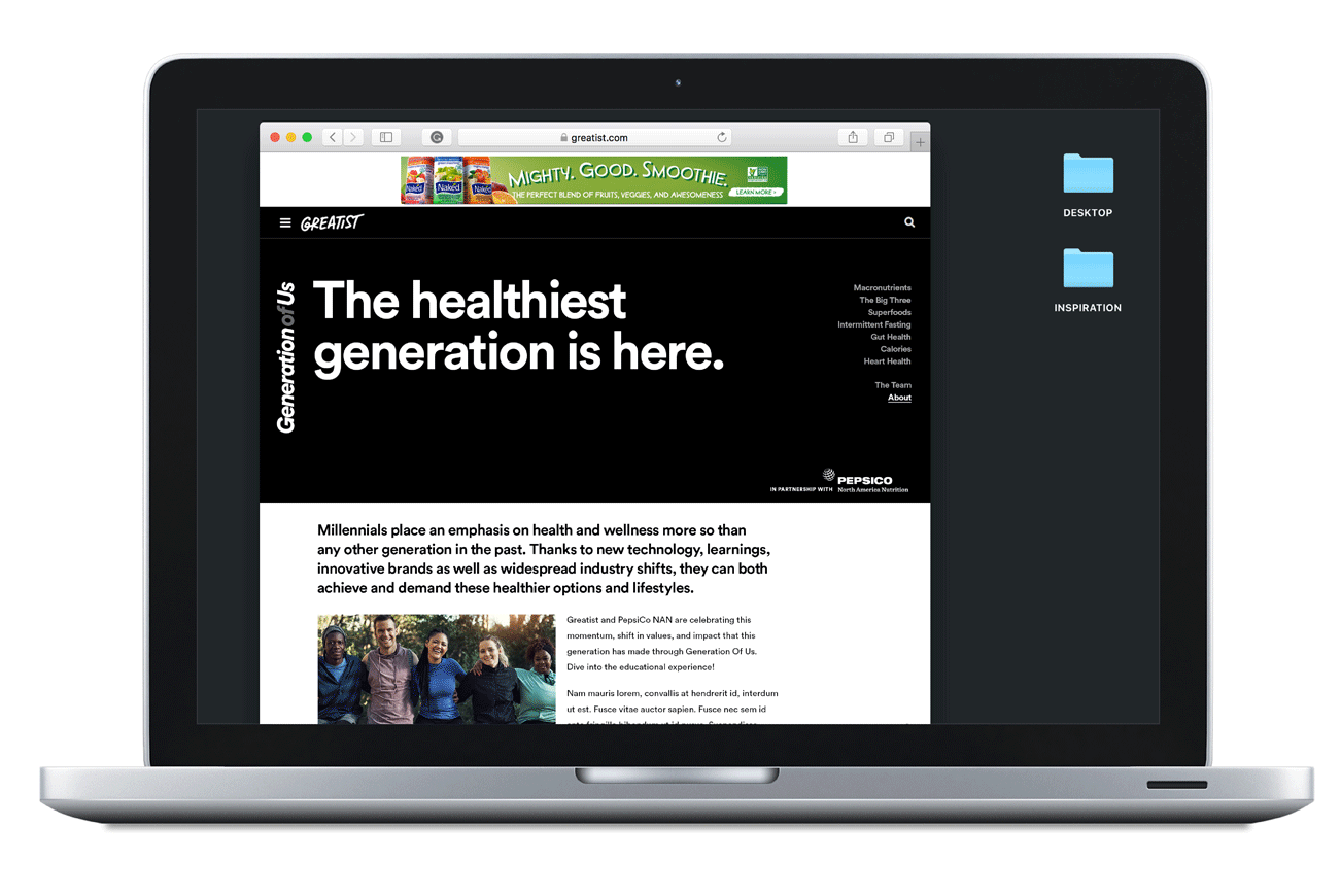
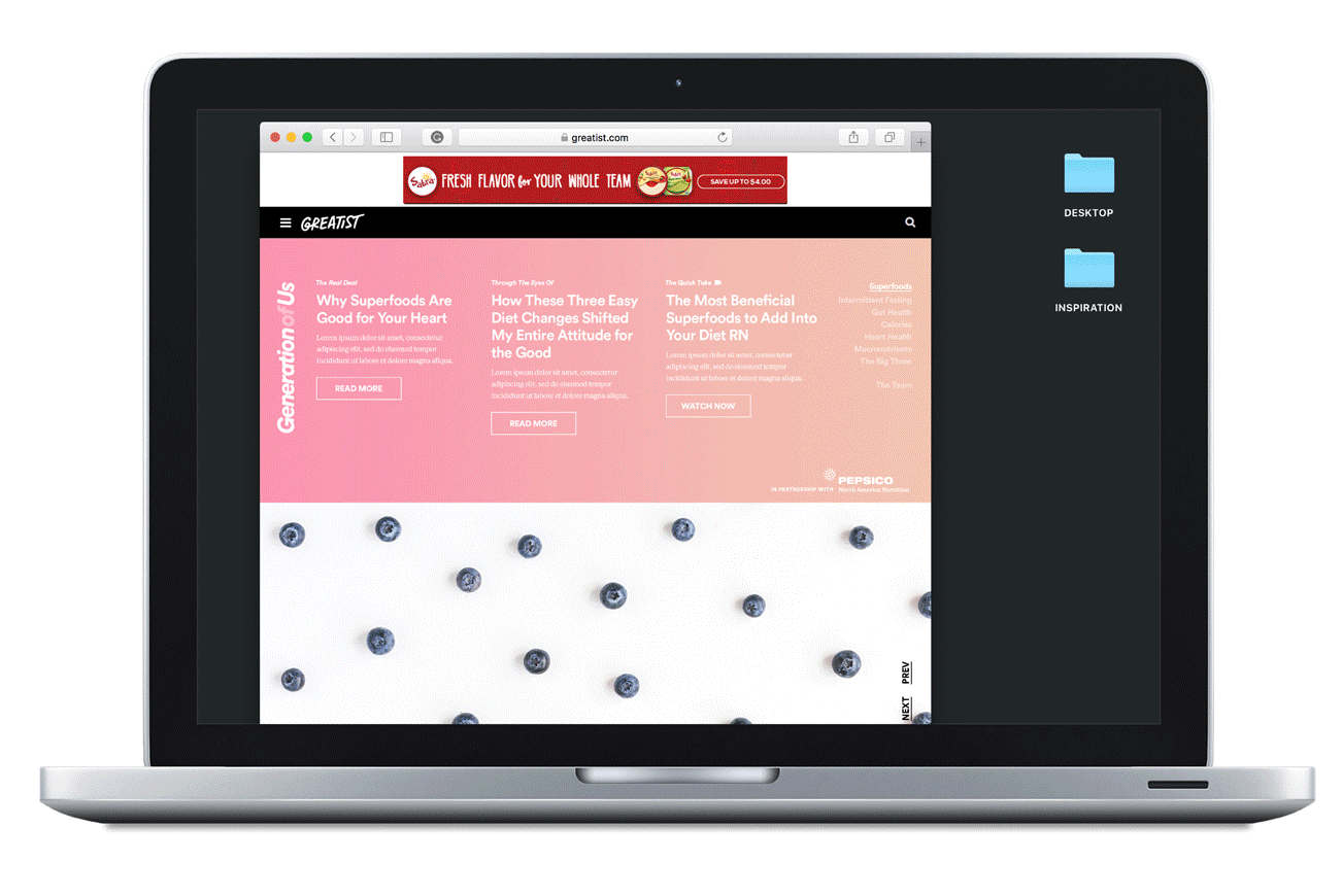
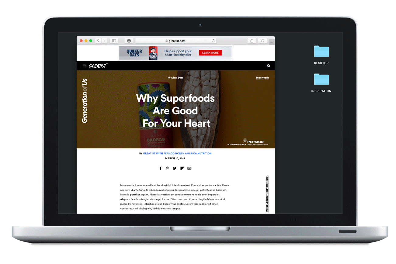


Greatist X pepsico
Design Director, UX, UI
PepsiCo North America Nutrition requested a year-long creative partnership with Greatist.com to empower consumers to navigate healthier, happier lives rooted in nutritional choices, behaviors and learnings. PepsiCo North American Nutrition provided qualitative and quantitative data showing and increased interest in healthy and nutritious food purchasing. Greatist’s research, as seen in the performance of past campaigns showed people are more susceptible to purchasing products recommended by a health expert or high-profile food bloggers.
Each month we tackle one large nutritional topic and dive deep into all aspects through creative verticals such as:
The Real Deal: a series of comprehensive explainers, breaking down the above topics
Through The Eyes Of: Personal journey stories as told by the Generation of Us team of influencers
The Quick Take: Quick, engaging videos that showcase the need-to-knows in :30s or less!


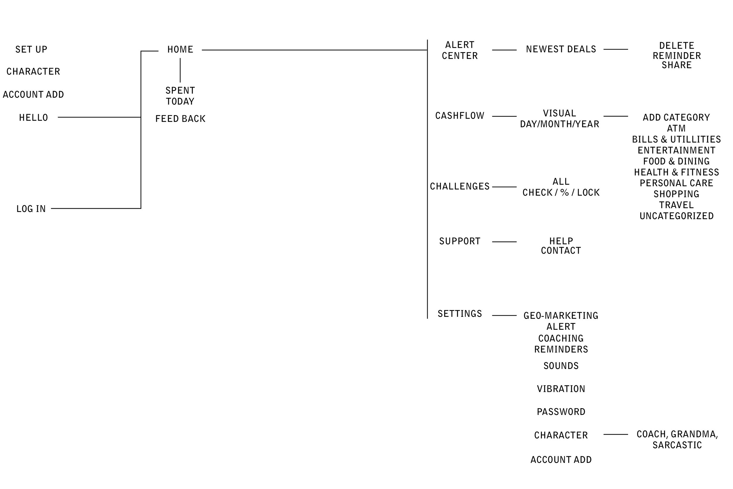
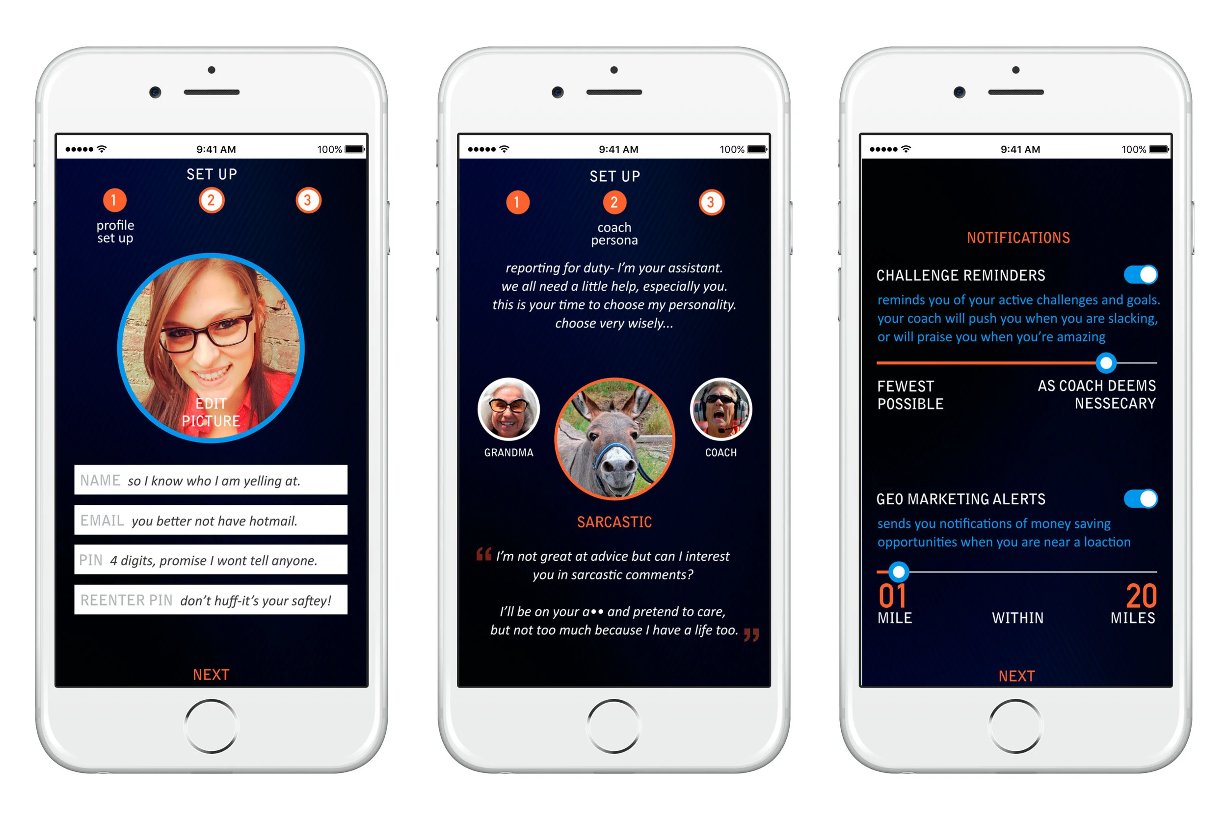

benjamin
Pratt Masters Thesis
The challenges associated with educating millennials on money management are vast. My solution, is called Benjamin, the personable financial assistant millennials have been missing. The app integrates 11 facets, covering all aspects of content, visuals, and UX: (1) Create a singular experience for all forms of money and accounts (2) Include advice based on previous habits (3) Utilize features and respect limitations of mobile devices (4) Personalized and useful notifications (5) Gamification (6) Reward users (7) Include personality (8) Make learning more visual (9) Typography (10) Color (11) Persona work
To read the full thesis, click here.

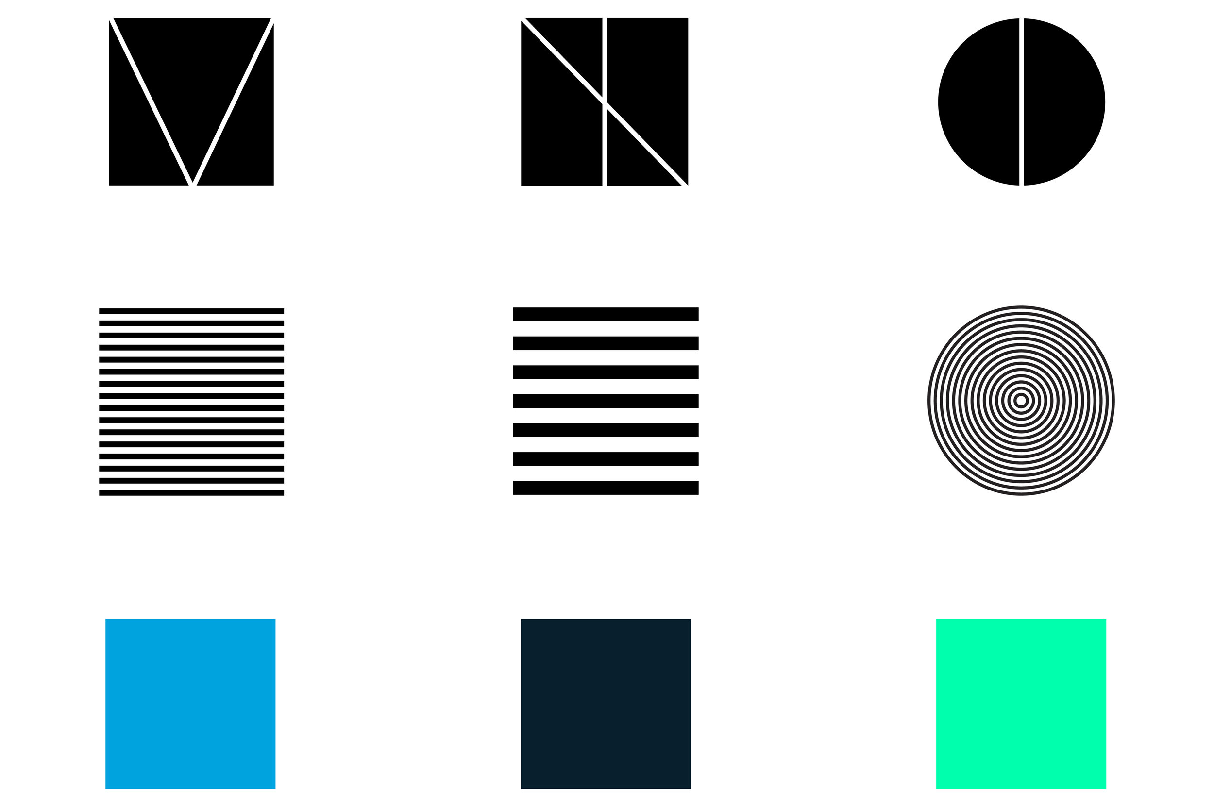
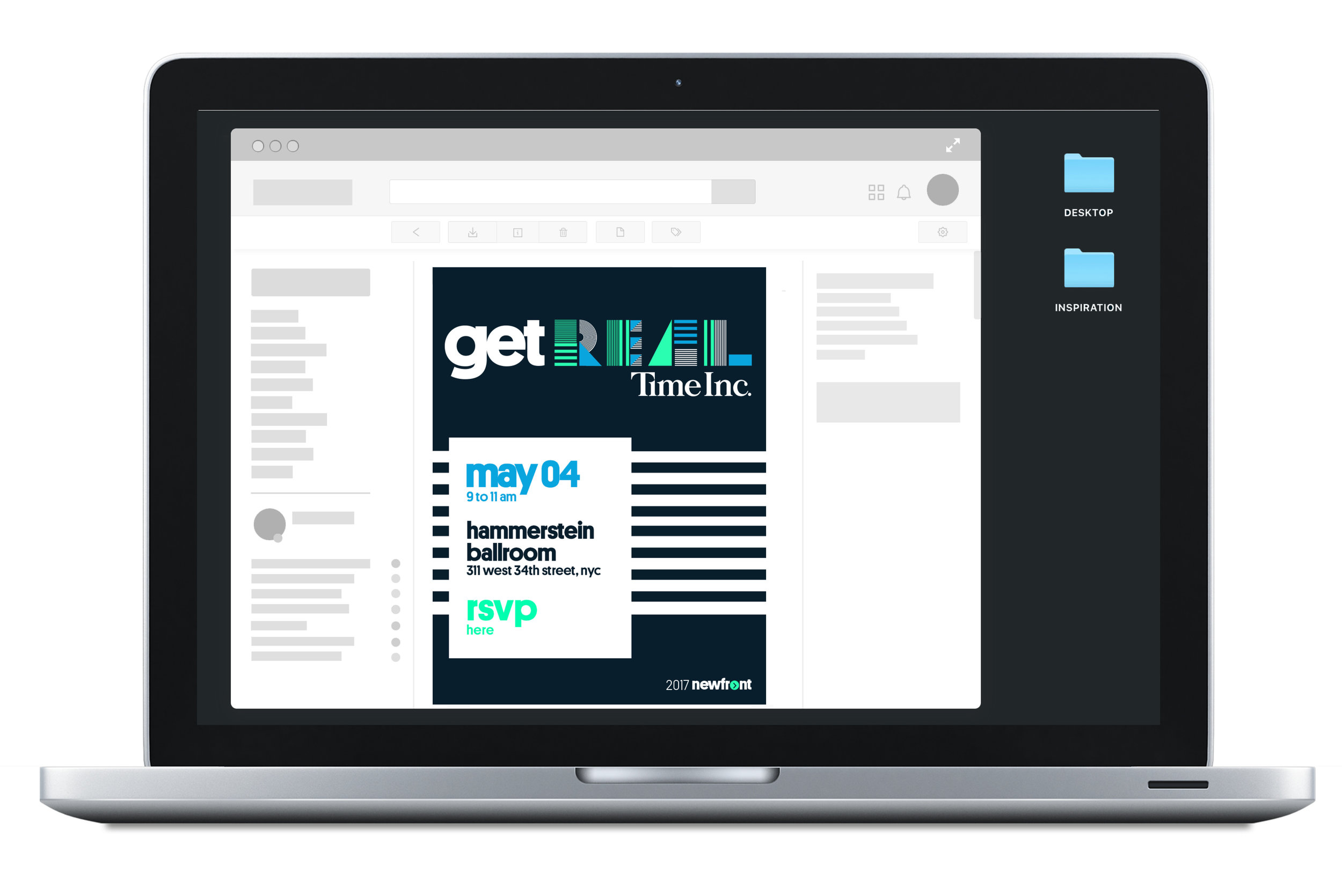
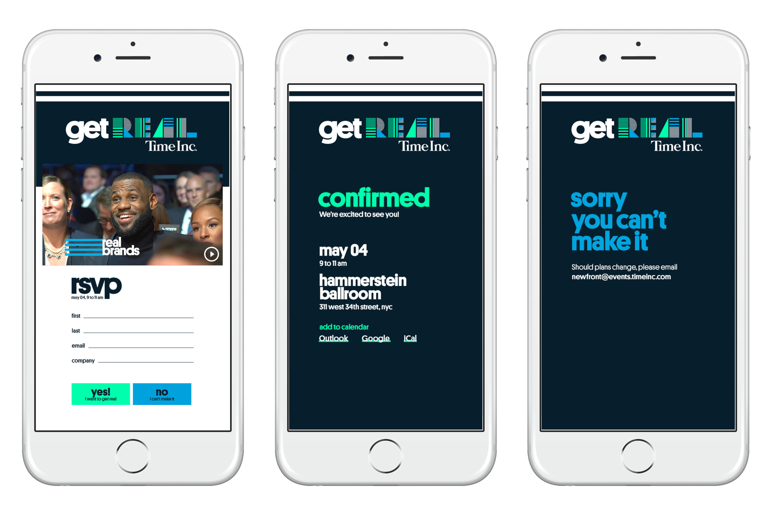
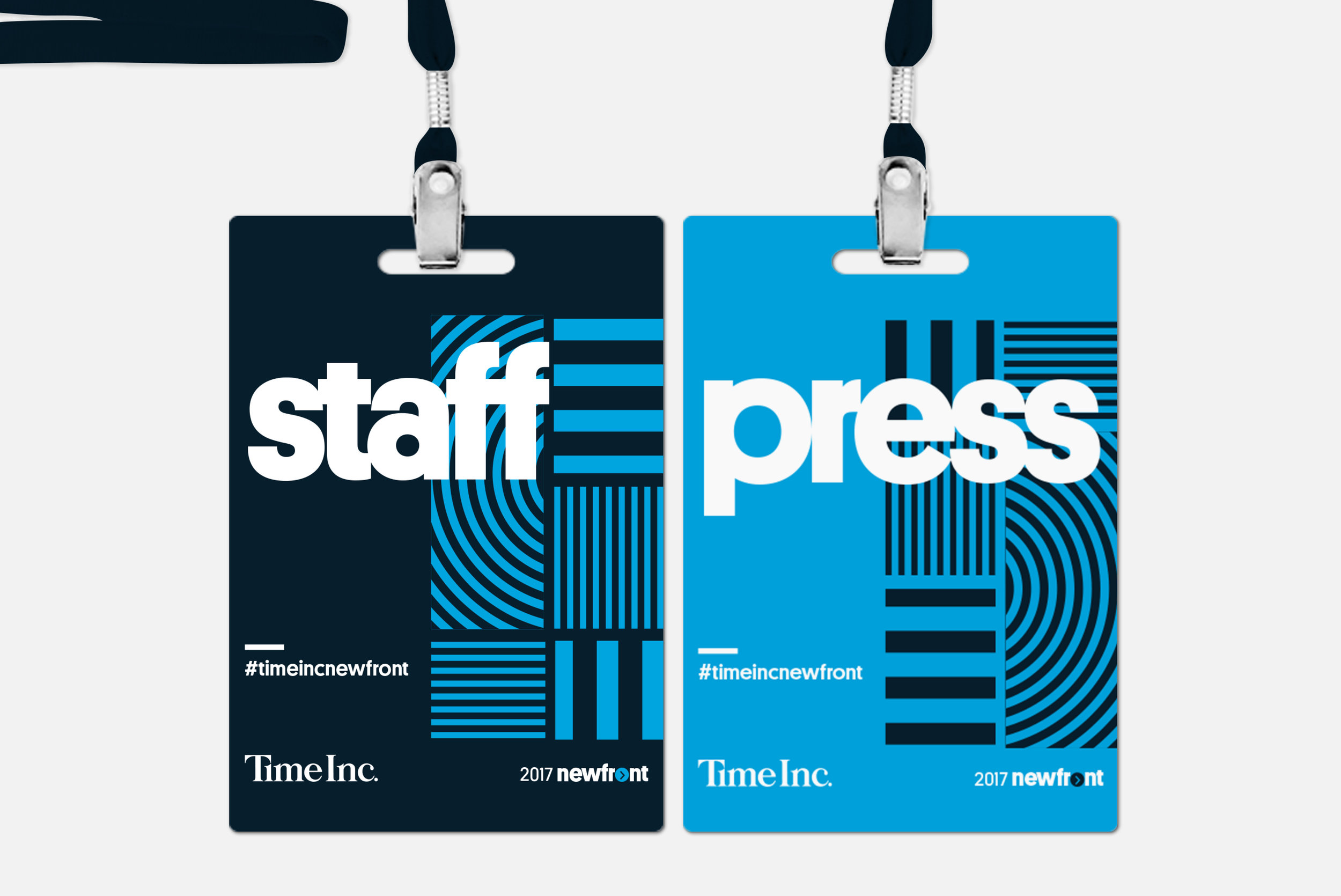
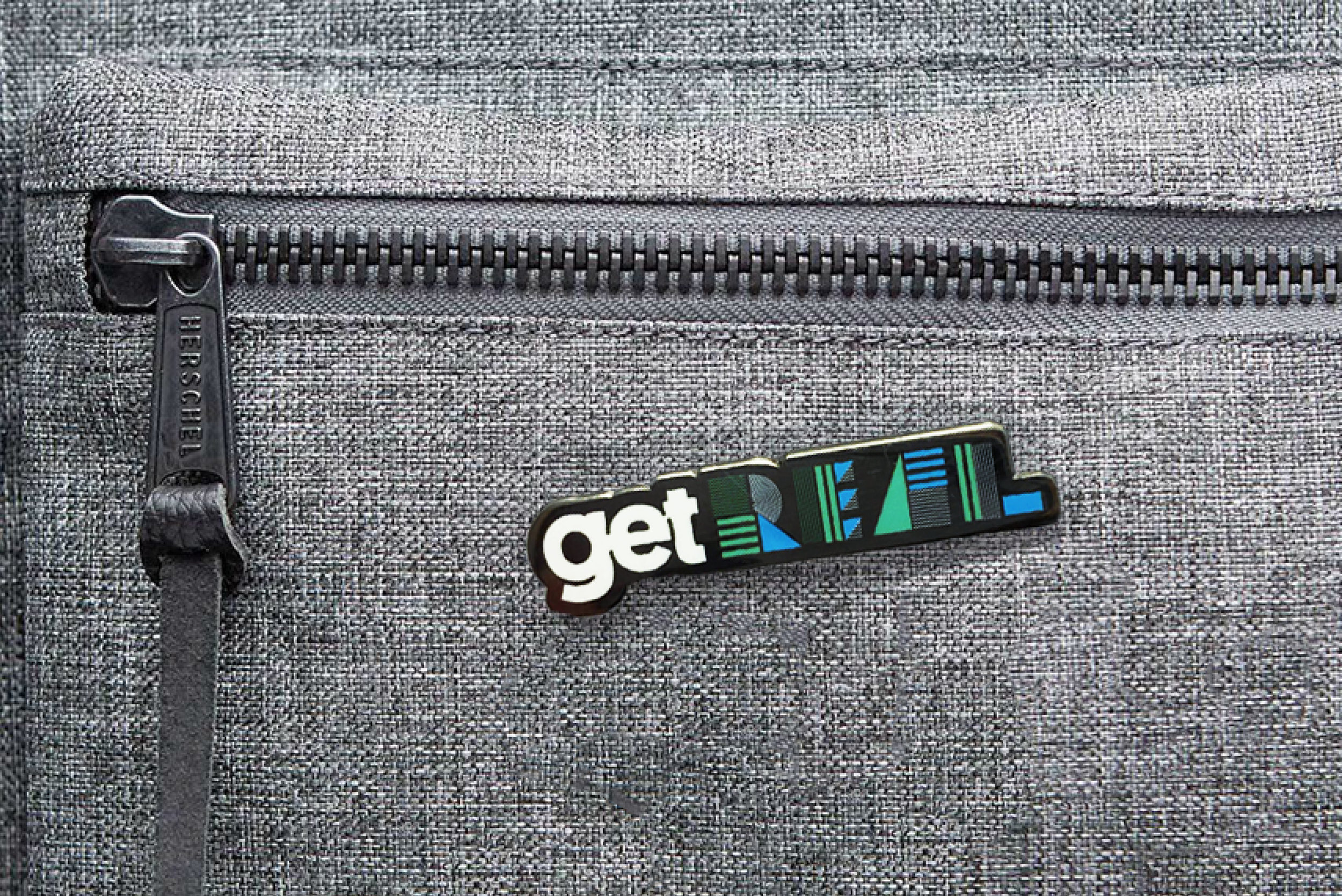
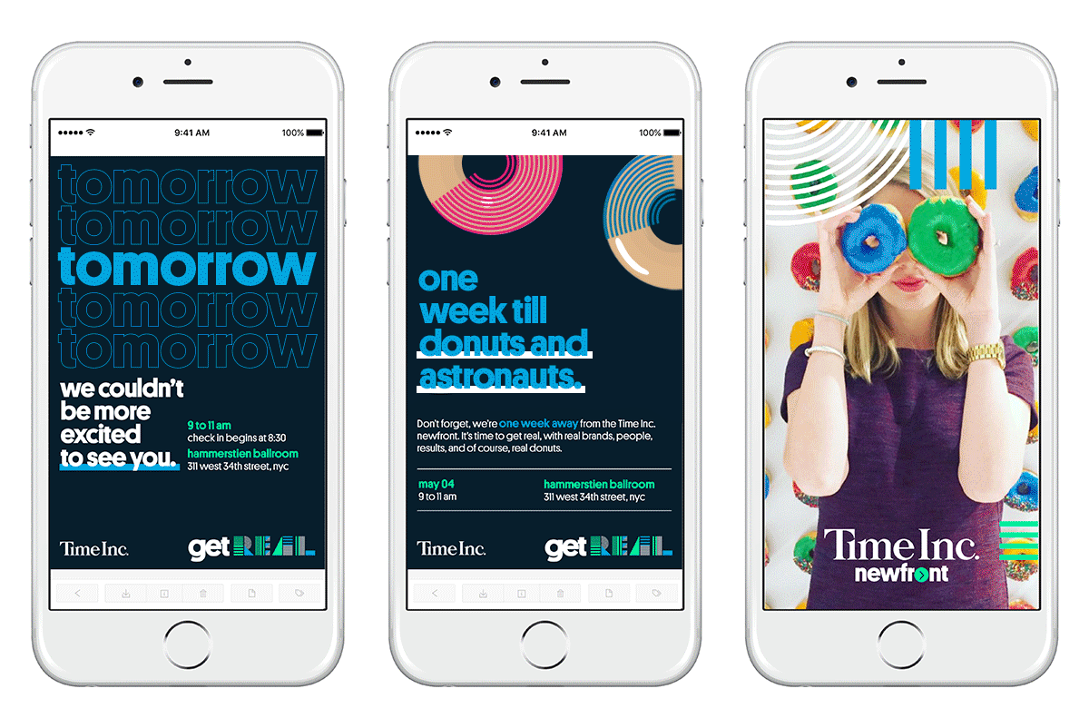
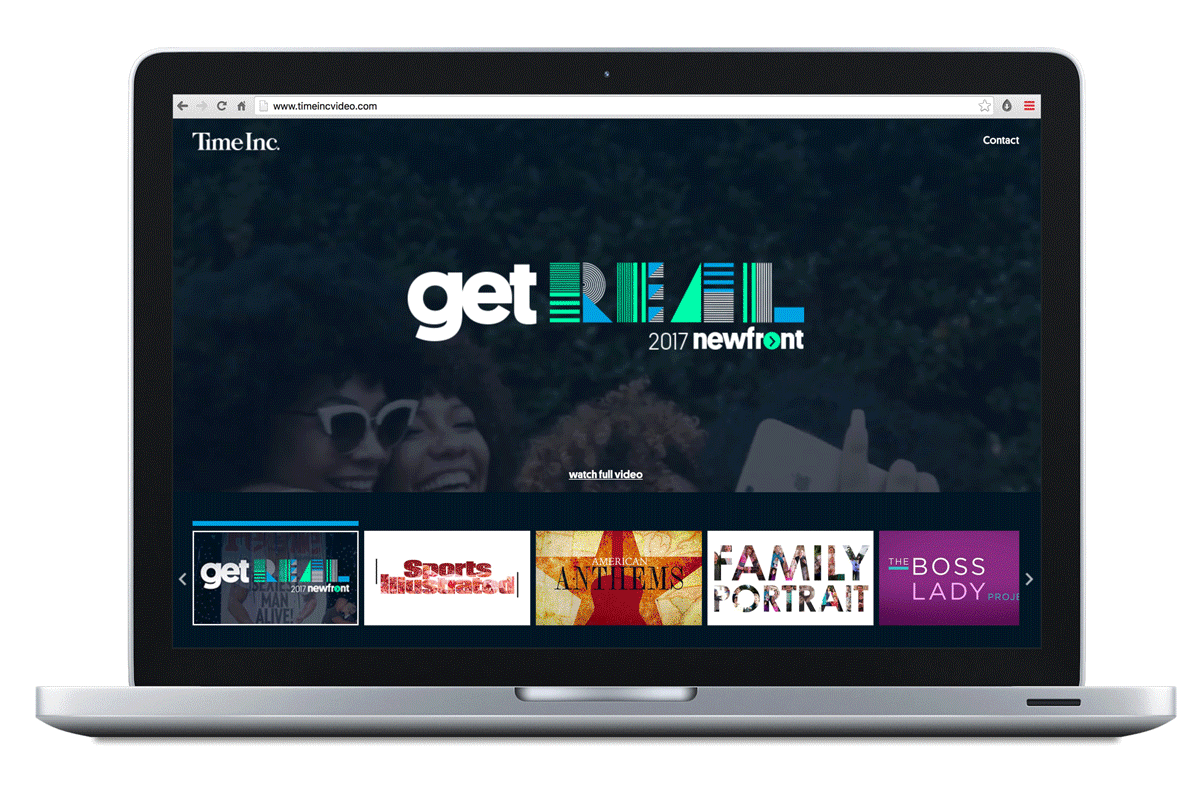
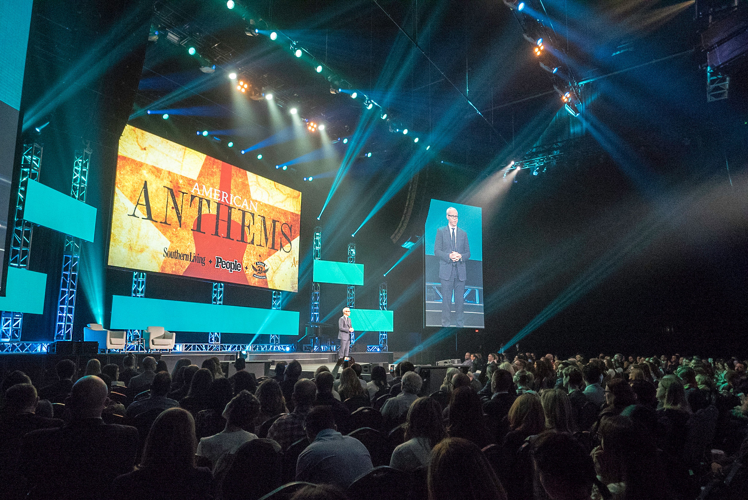
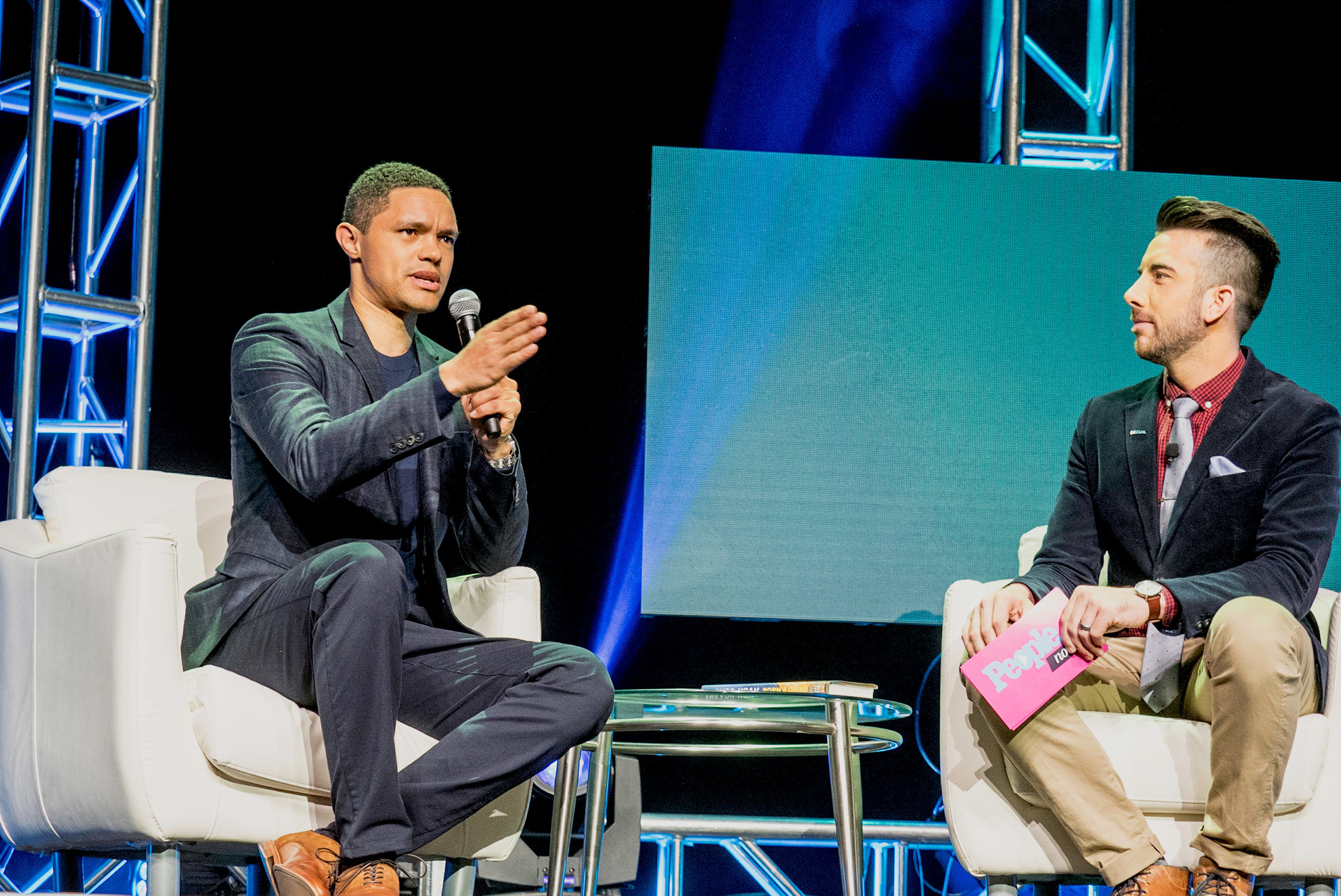
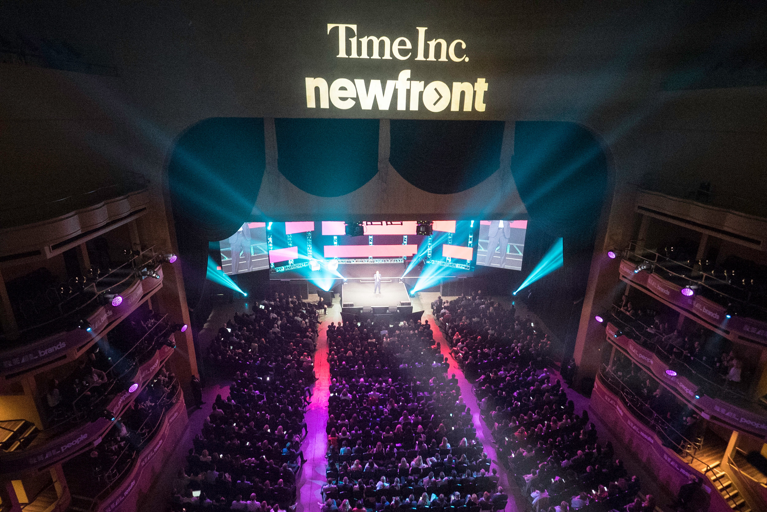
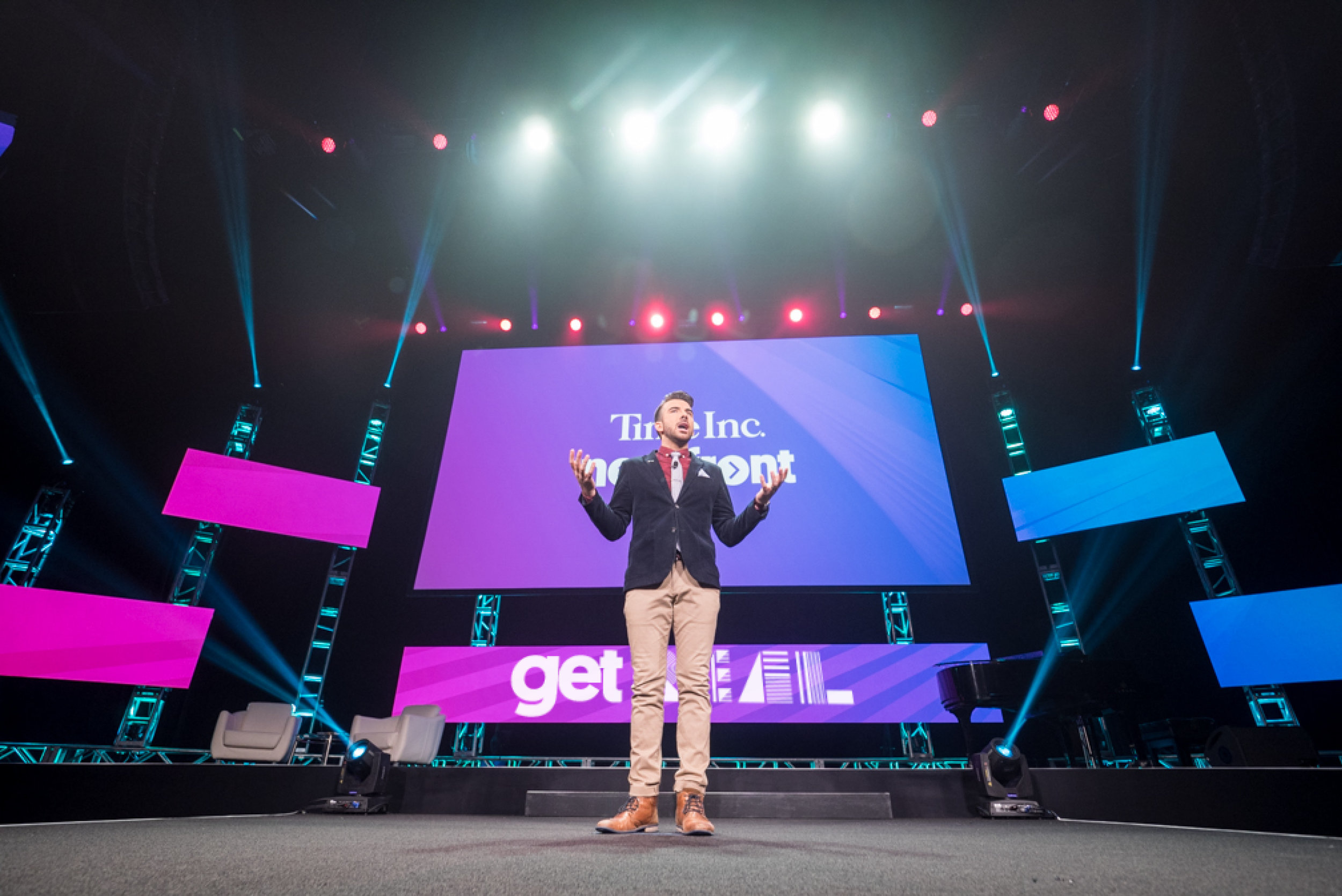

Time inc. Newfront 2017
Art Director
Time Inc. established a three pillar focus for the 2017 NewFronts: Get Real: Real Brands, Real People, Real Results. We took a direct shot at “fake news” with our trusted content and diverse portfolio. In the past year our video production and consumption has grown 100% year-over-year, it was our time to establish awareness and awe with our advertisers and media execs.
Using the three pillars as the foundation of our design, I created a building block for the event—slick geometrical pieces that exuded movement, while having a strong framework. This strategy was carried out across the event, as the shapes, patterns, and color modules that made up the logo were calculated but flexible enough to adapt to infinite applications. Visit timeincvideo.com for the full web experience of NewFront 2017.


Real simple’s beauty & balance
Designer
Real Simple continuously empowers women to lead a beautiful and dynamic life across all components of her busy lifestyle. All this is brought to life at the annual Beauty & Balance weekend hosted in NYC.
We designed the event to be reflective of the power and beauty of women. Through out the weekend we empowered women to “Get Up and Glow” with makeovers, hairstyling, fitness classes, Real Simple editor workshops, and more. Branding carried across all elements from evite to social media, and day of activations.


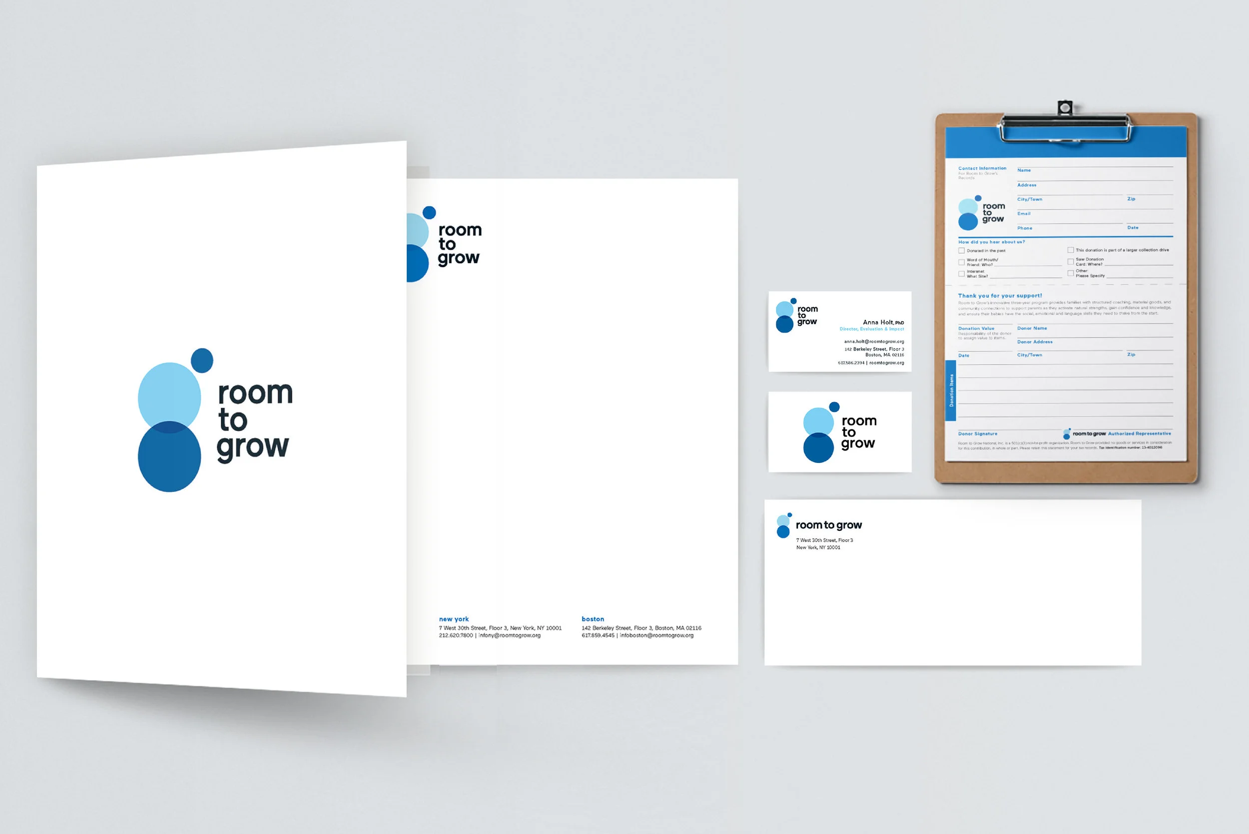


Room to grow
Design Director
Room to Grow serves families from just before their child's birth through age three, providing individualized parenting education and support, high-quality material items, and specialized referrals to vital community resources to ensure a healthy and secure start in life. Room to Grow was founded in 1998 by Julie Burns, but the logo was redesigned in 2018, needing new branded materials—from business cards to donation forms.
The logo represents the three pieces of the relationship: parent, child and organization. The colors, friendly and open. The playful animation leans heavily on the notion that young children learn most through play, therefore the three balls bouncing into place.


cozi family planning app
UI Designer
Time Inc.’s acquisition of Cozi, a family planning app, naturally bridged technology with Time Inc.’s editorial content. The app has a suite of family tools including articles, shared calendars, shopping lists, to-do lists, and recipe-boxes that advertisers could take-over with custom branded content. Collaboration between Cozi and the client allowed for seamlessly integrated advertising for consumer consumption. Brands such as Clinique, Staples, and P&G all achieved above-average impressions on the app.
16.1M total registered users*, 11 visits per day (on average)*, Rated 4.5 stars on iTunes, Mom’s Choice Award (2015) *as of 2015 from a proprietary Cozi Survey


30 days of doable change
Design Director, UX, UI
Greatist wanted to approach the new year from a different angle—more into fun baby steps than sweeping, unrealistic lifestyle changes. 30 Days of Doable Change spanned execution in a micro-site, social, video, daily newsletter tips, and general promotion. Visit greatist.com for the full web experience of Greatist’s 30 Days of Doable Change.


Design Director, Branding
MAD+FAB is an architectural design and fabrication studio currently in the NEW INC. incubator—where new ideas are explored at the intersection of art, technology, and design.
MAD+FAB was founded in 2012 by Namita Modi, a LEED-accredited architect, and later joined by Lily Tagiuri, an environmental industrial designer. They started the Air Series to design a system of objects that address large-scale urban air purification, which can be installed in public spaces in NYC, improving air quality and public health awareness.
The logo is simple, strong, and abstract. We had to the opportunity to convey many allusions in this logo. Strong lines help convey industrial references, while also giving subtle cues to the NYC street grid. And the color helps support the concrete building materials along with the hue of air.
When possible the logo would be tucked in a corner, either bottom right—helping further support the idea of a strong building block, or top left—supporting the notion of airiness, and infinite floating space.


StubHub Preroll
Senior Designer/Animator
StubHub requested creative to run across Time Inc. sports sites including Sports Illustrated and Golf.com. Focused on video content, their brief was simple, asking for short, on-brand preroll—one that could run on golf.com adjacent to tournament coverage, and a second, more universal approach.