Tinybeans App Onboarding
The Challenge
Tinybeans is a private alternative to social media, where parents can easily share family memories and consume content and inspiration for local events and at-home activities. While onboarding users how can we educate product and value, motivate to start a free trial, and set users up for success within the app?
Deliverables
User flows, user research, UX, web/iOS/Android interface design
KPIs
+ Increased completion rate by +885%
+ Increased % of users who start a free trial by +19%
- Decreased self-reported confusion of what Tinybeans app offers
Team
Sarah Argus, Director of Brand and UX
Nadia Kim, Product Designer
Kelsey Schroth, Senior Product Manger
Alberto Mastrotto, Senior Product and Insights Analyst
-
History
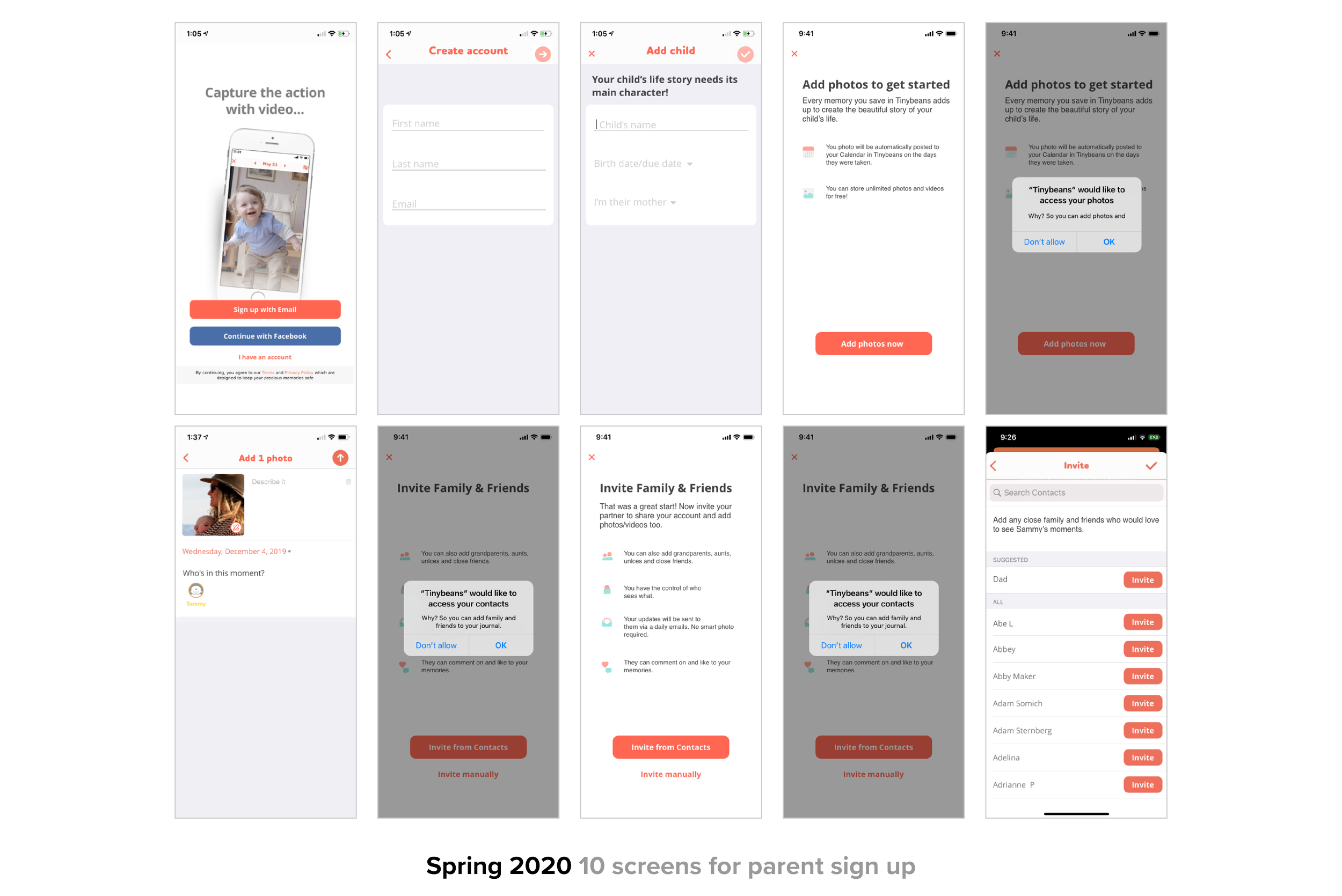
In Spring 2020 Tinybeans had the longest, most involved version of onboarding. In addition to the standard account details, it asks users to add a child (name and age), add a memory (upload a photo), and add followers (invite contacts to follow their journal). All in all, there were too many steps leading to user fatigue, with an extremely low completion rate.
Personas
There were 3 audiences for onboarding: primary parent who set up the account, secondary parent who shared permissions, and all “followers” of the family.
Opportunity
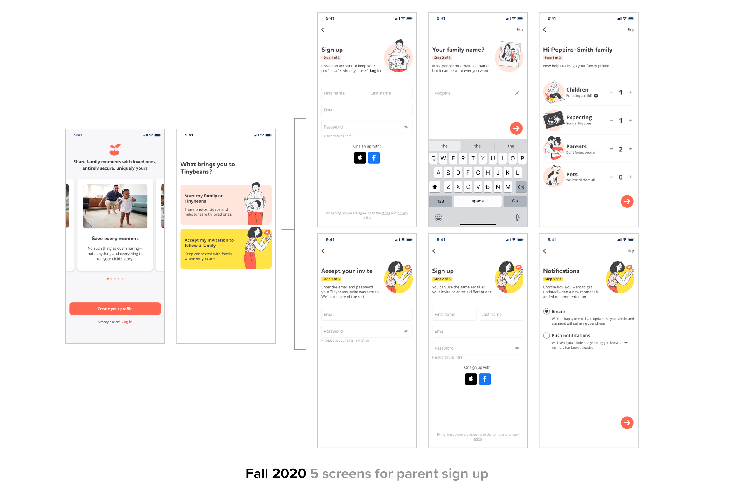
After competitor analysis and user interviews we knew there was an opportunity to separate sign up from set up. We’d focus all our efforts on getting users into the app without extraneous tasks or too many personal questions. -
How do you distinguish between mandatory and nice-to-have have questions in onboarding?
I noted each piece of user information on a post-it note, then partnered with the PM and data analyst to determine where each piece of data lay on a scale of must-have to don’t-need. When reviewing with stakeholders we discovered that a few nice-to-have items were actually used to personalize email win-back campaigns so we found creative ways to include those questions.Does the app accommodate a variety family types?
It was important to be inclusive of all families so we created two onboarding joineries, one user flow for family sign up, and a second for followers. This not only allowed us to ask unique questions for each audience segment, but helped improve our “accidental sign up” rate.What if a user doesn’t want to provide personal information?
Within the new onboarding experience we included the “why” behind each question, for example when asking followers if they would prefer emails or push notifications, we provided this context “Choose how you want to get updated when a new memory is added or commented on.”How much education is just enough to entice people to sign up?
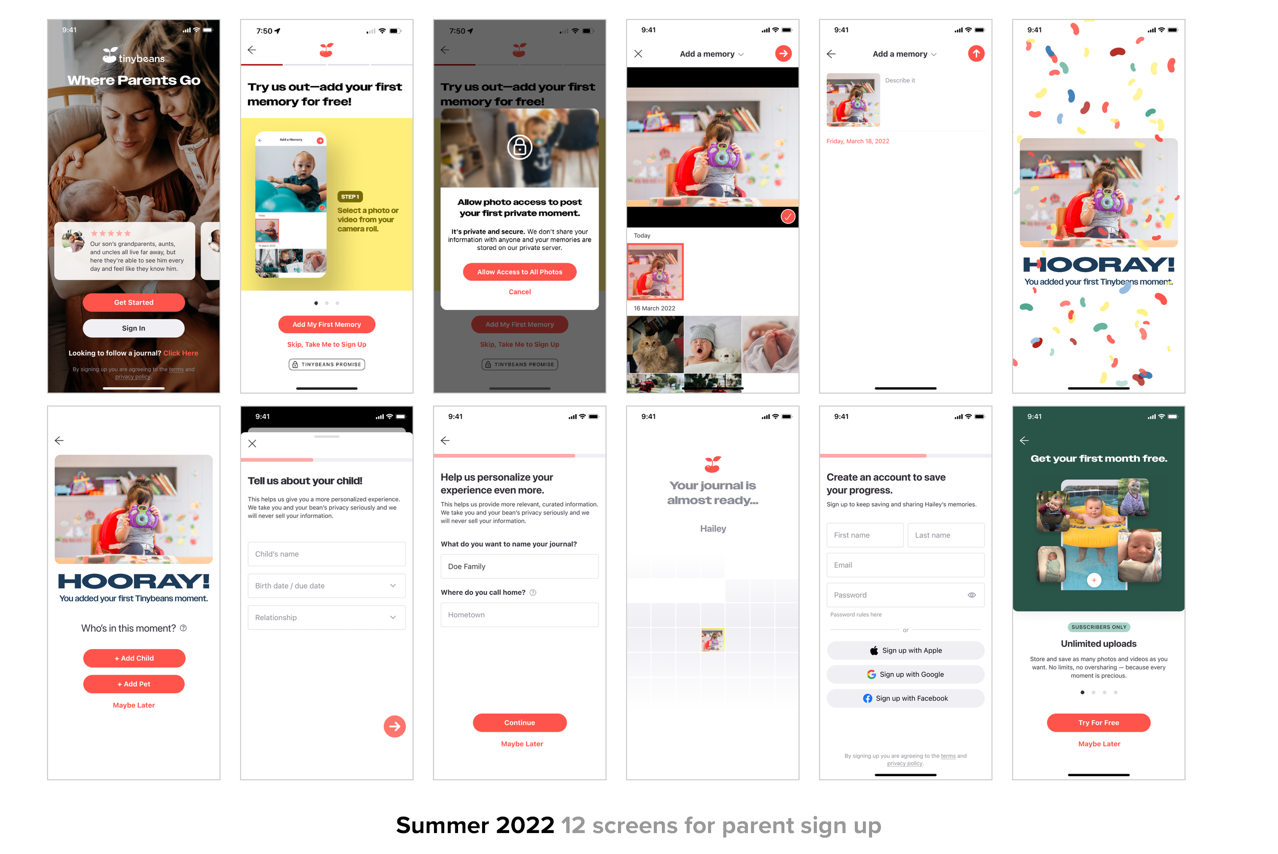
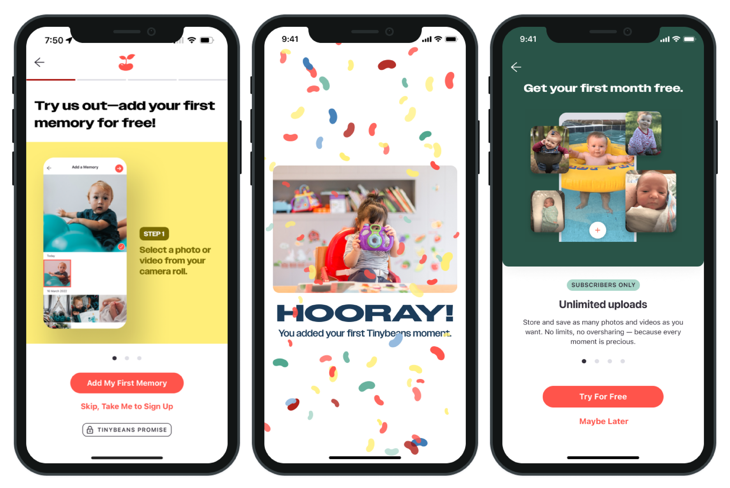
Through user testing we found that users wanted to see the app prior to committing. In order to stay within scope of the project, I designed a gallery of cards that users could swipe through prior to providing any information. These cards showcased our most loved features with corresponding visuals. -
Unmoderated User Testing
We tested different flows, communication styles, and UI. Each of the variants was tested against the existing flow. Then we went into a tournament-like bracket style of testing—comparing the winners of each variant to the next. In the end we followed what tested best even though internal stakeholders didn’t love the solution.AB Testing Live
In Fall 2020 we tested the winning design against the existing variant live in production. We were overwhelmed with the results—seeing an 885% increase in onboarding completion.
Iterating
Although removing extraneous steps helped the completion rate, it also removed much of the life of the onboarding experience and didn’t showcase what makes Tinybeans different or special. We decided to circle back to the project after (1) we rebranded and (2) our subscription model was more solidified.In Summer 2022 I managed a product designer through another iteration. It’s here where we were able to add more brand value. We ran more unmoderated user testing and tweaked the design based off of findings. If we needed to add steps in the user flow it was important that it was worth the extra effort. Additional steps were added around (1) privacy assurances, (2) permission primings, (3) surprise and delights, (4) social proofing, and (5) even more sneak peeks into the product.