Imperfect Foods
The Challenge
By effortlessly introducing customers to our mission, what it means to sell “imperfect food”, and highlight the features that enable customers to get what they want in each order, more new customers will be excited to try Imperfect and convert.
Deliverables
Persona, user research, wireframes, UX, UI, design system improvements, internal tool design, QA
KPIs
+ Increased first order CVR by 2.5%
- Decreased bounce by 45.4%
- Decreased CAC
Team
Sarah Argus, Product Design Manager
Ben Kane, Senior Product Manager
Jason Arold, Engineering Manager
Illustrator, Tegan Harmonay
-
Personas
Our primary user for this project was a new customer. Collaborating with customer support, I identified the pain points which new customers wrote in about. Additionally, I reviewed data from the cancelation survey from users who had placed fewer than 3 orders. Using this data, I crafted a persona.
Interviews
I interviewed 12 people which mirrored our primary demographic but had never used Imperfect Foods. Through moderated user testing, I observed users sign up for the service, prompting them and asking questions a long the way. These were the customer problem statements that I had decided to solution for with this project:
1) I just signed up for Imperfect and am shopping. I don’t understand what it means to sell “imperfect” food.2) I am shopping for my first order and I don’t understand how Imperfect is different than Whole Foods or Trader Joe’s. I’m not sure why I should make this effort to shop with Imperfect.
3) I am shopping for my first order and I’m not sure how to get what I want each week in my box.
4) I am shopping for my first order and I’m confused why there is already food in my cart.
-
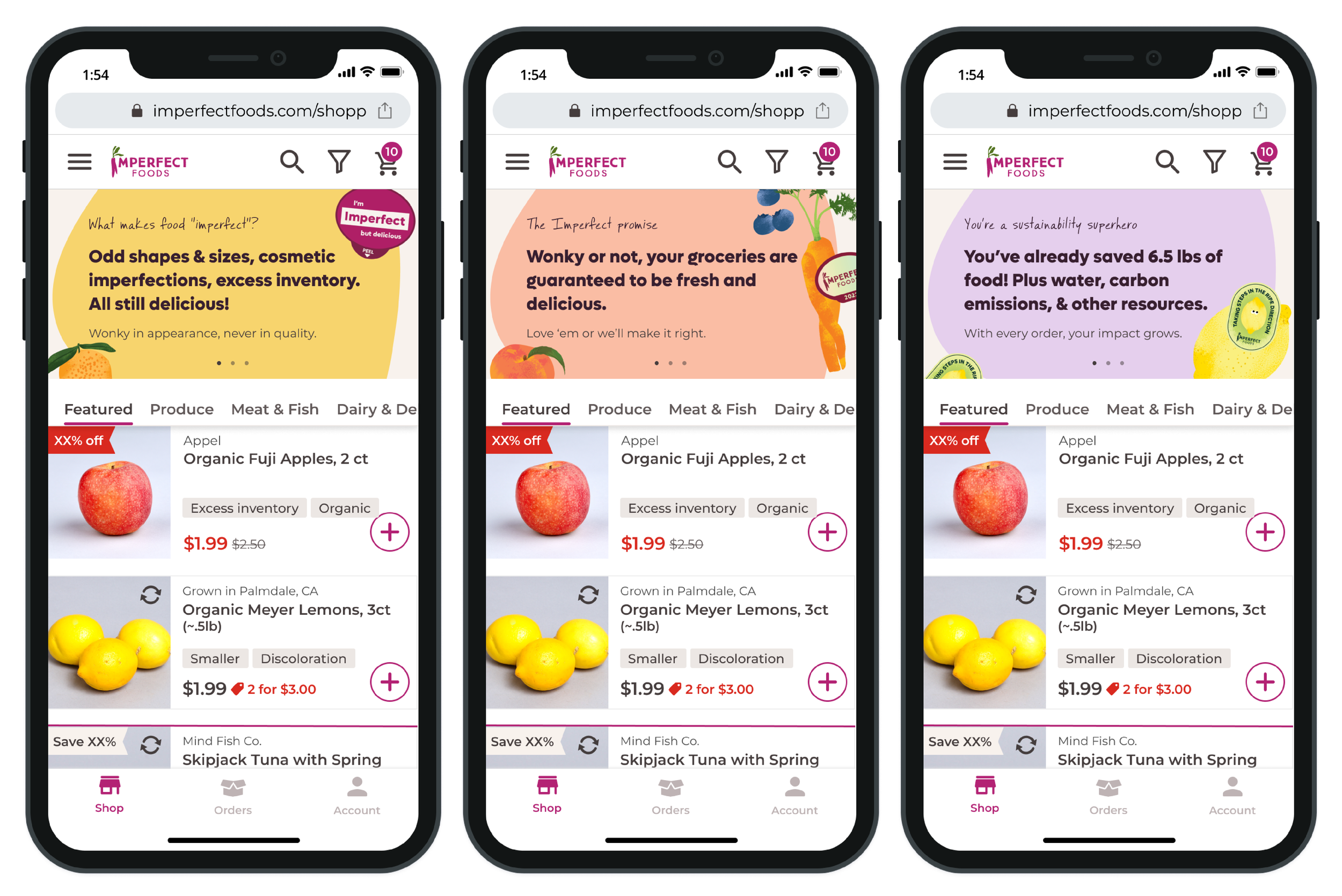
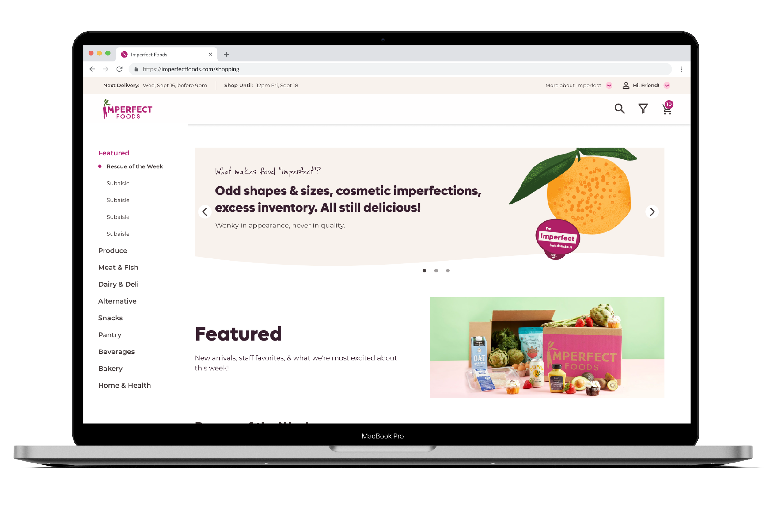
Where should we introduce educational moments?
Through user interviews, I found that people had an average of 6 questions that we could easily answer through quick educational moments. However, I found that most questions related to the brand mission or subscription, not related to the UX of the shopping experience. Learning this removed the option of tooltips, concluding that a gallery, outside of shopping would be best.How to we provide education without overwhelming the user?
Our biggest balancing act was deciding how much education we provided. I determined the gallery should have three slides, and the gallery content would change over the course of their first three orders. Mapping out these educational moments allowed for the cognitive load to be lower, while also answering questions in the most pertinent time period. For example, customers don’t necessarily need to learn about our packaging return program until after their first order and they have icepacks, wrappers, ect. at home. Using this logic, we showed our “How to return packaging” slide on the customers 2nd order.How do you create a new UI that can get shipped quickly but also be flexible enough for various types of content.
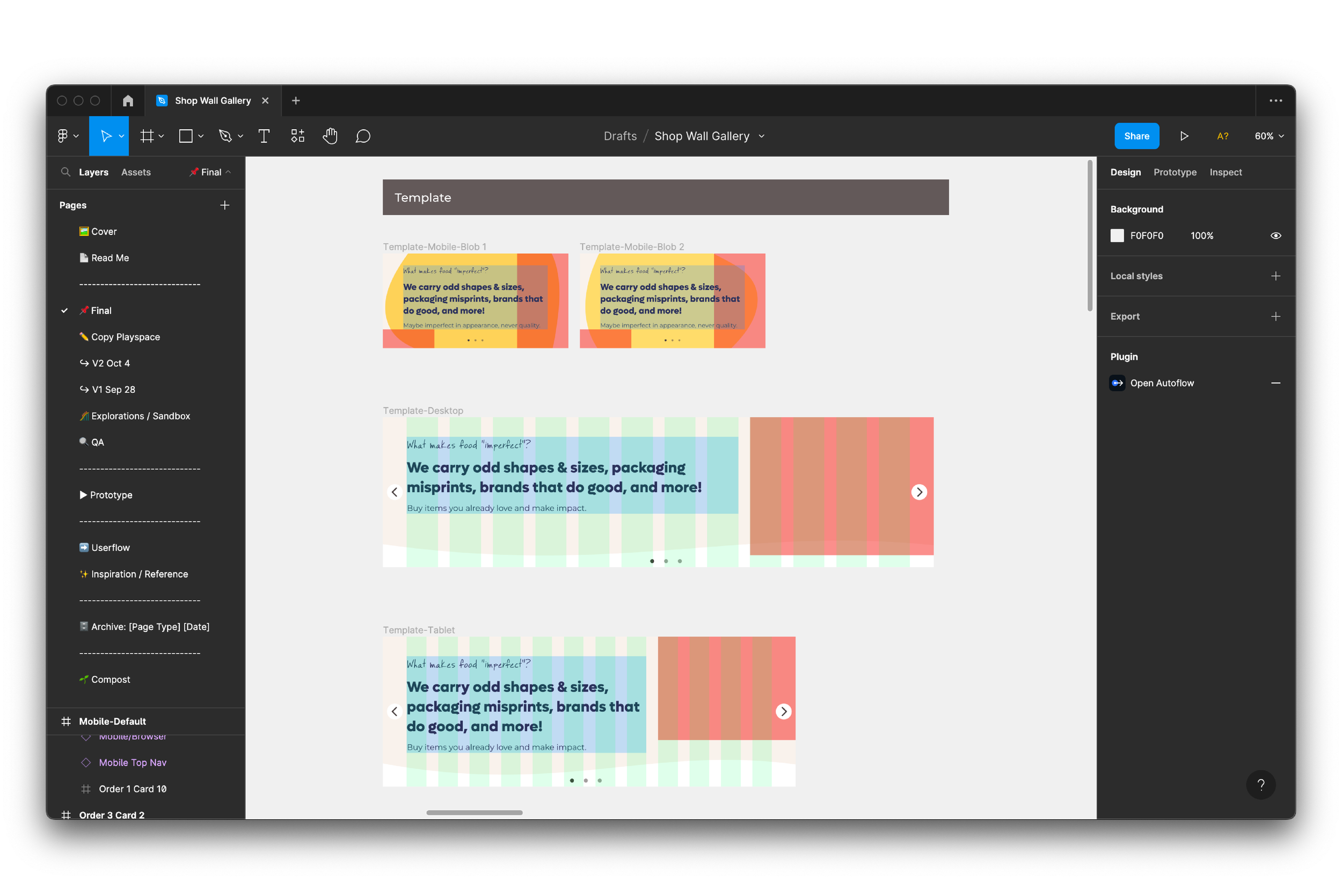
I created a new design system organism which templitized the gallery cards. Each card had 2 placements for imagery, a block for copy, and a background. Creating this component in our design system enables us to reuse this for other projects and iterate on the content easily. -
New gallery component
Creating an educational gallery above the shopping experience was a clear winner. It tested well in usability testing and it positively impacted our metrics. Aside from increasing new user conversion, we saw a decrease in customer support tickets from new users.AB Testing
At Imperfect, the majority of our released are rolled out in a phased approach. When we first rolled this project out we saw positive metrics for example first order bounce decreased from 4.8% to 3.3% in the test group. Seeing positive metrics like this ensures confidence that the UX/UI are performing as hoped and we’re confident to launch to larger audiences.Iteration
Our next step is to iterate on content and placement. At present the gallery is only visible for a users first three orders and it sits at the top of the shopping experience. This is highly valuable real-estate. In the future we are re exploring placement options further down within the shopping aisles . Additionally, we’re partnering up with our marketing and merchandising teams to A/B test engagement with other types of content outside of the first three orders.