LOLA E-commerce
The Challenge
Feminine care purchasing habits are extremely habitual, users purchase the same products their female caretaker had (and are generally content) but how could we enhance the traditional store experience with a digital product?
Deliverables
Persona, user flows, user research, UX, web interface design
KPIs
+ Increased PDP CVR by 5.2%
+ Increased total site CVR by 5%
+ Improved subscription management CSAT to 4.8+
Team
Sarah Argus, Senior Design Manager
Anna Konopacz, Director of Product
Jeffrey Magida, Senior Marketing Manager
Abeeb Ola, Senior Software Engineer
Greydon Herriott, Photographer
-
Personas
I led a persona workshop across the organization and our persona hypothesis consisted of 3 different archetypes which we used to facilitate discussions about our user’s needs, desires, and varying contexts of use. Through careful analysis of purchasing data, unmoderated user-research and brand studies, we identified key behavioral variables. These variables were categorized into segments such as product preference, frequency of purchase, purchasing history, and lifestyle.
Prioritization Process
Combing through research, brainstorm ideas, and historical development, I categorized ideas into buckets, segmenting behavioral affinities, content, and features. This gave me a way to visualize what existing functionality and content would be useful, what needed supporting, what opportunities were available to innovate on, and also what could be discarded. Afterwards, I entered all the ideas into a chart and prioritize them against persona needs, tech feasibility and business objectives. This informed our phasing strategy and roadmap.The product team moved forward with two new features to improve the purchasing path for our personas: 1) optimization of the product page and 2) product collections page redesign to incorporate quick add.
Research
I used unmoderated user testing to test value sentiment around the new features for quick add and the product page. We used the answer to help prioritize hierarchy of features in the new layouts. A few example questions –What information is most important when shopping online?
What information is most important when shopping for period products?
Out of the following list of features, please rate from what is most valuable (10), to what is least valuable (1).
-
How did you innovate on the store experience with a digital product?
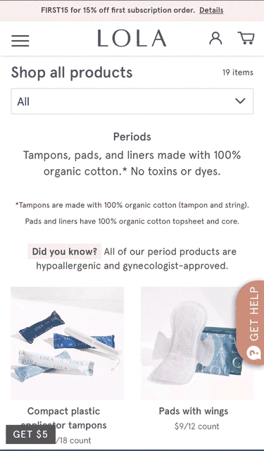
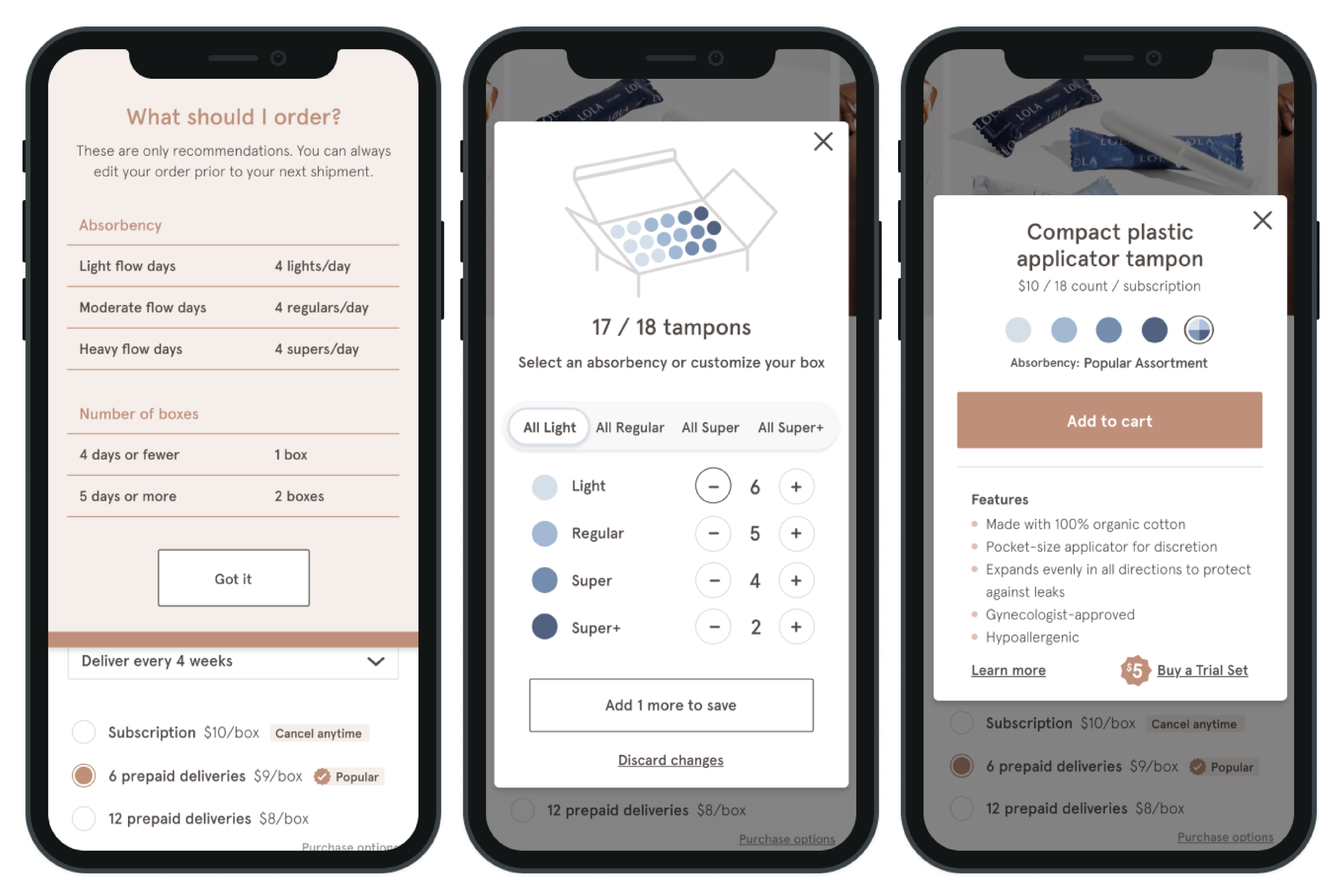
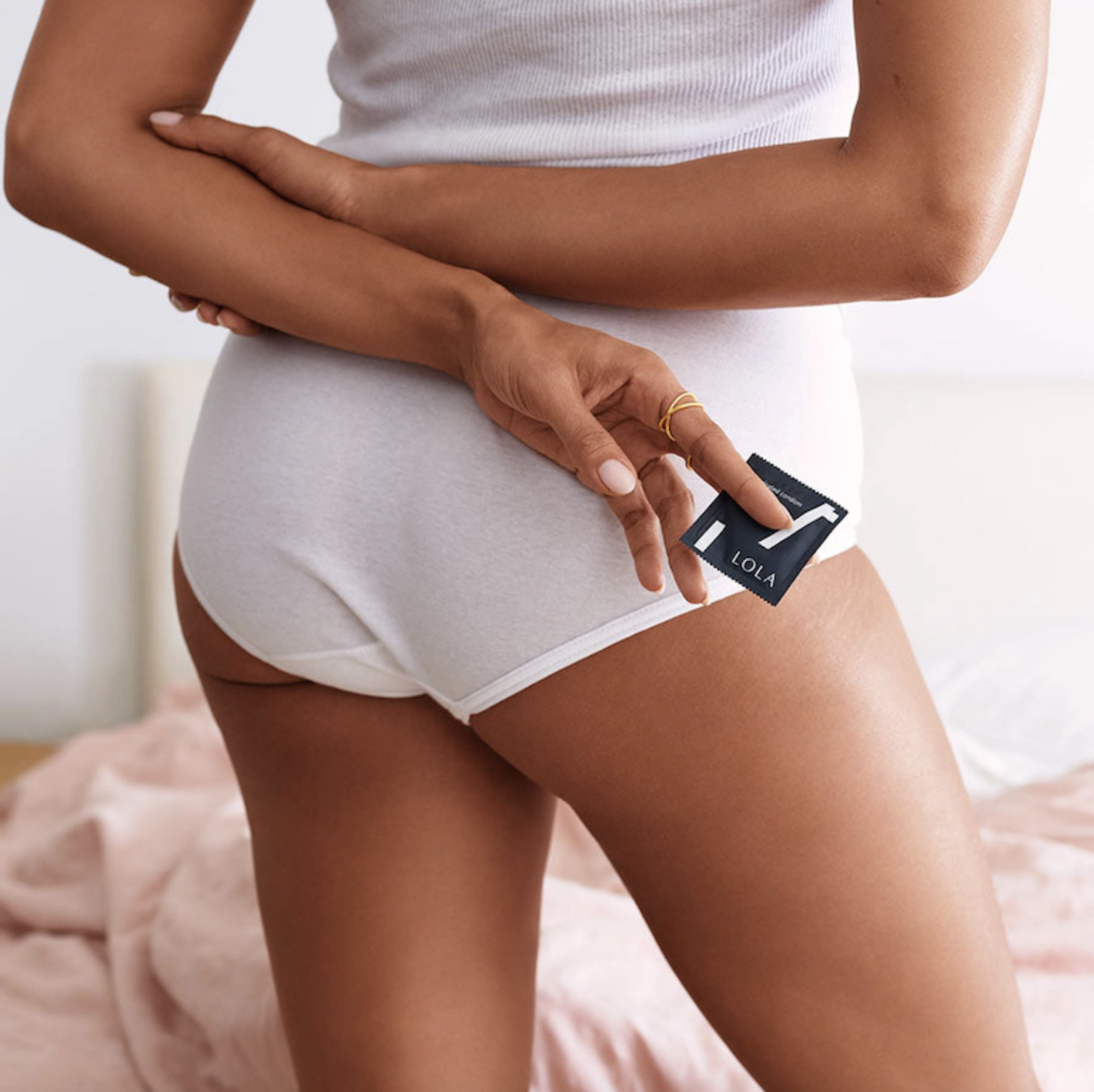
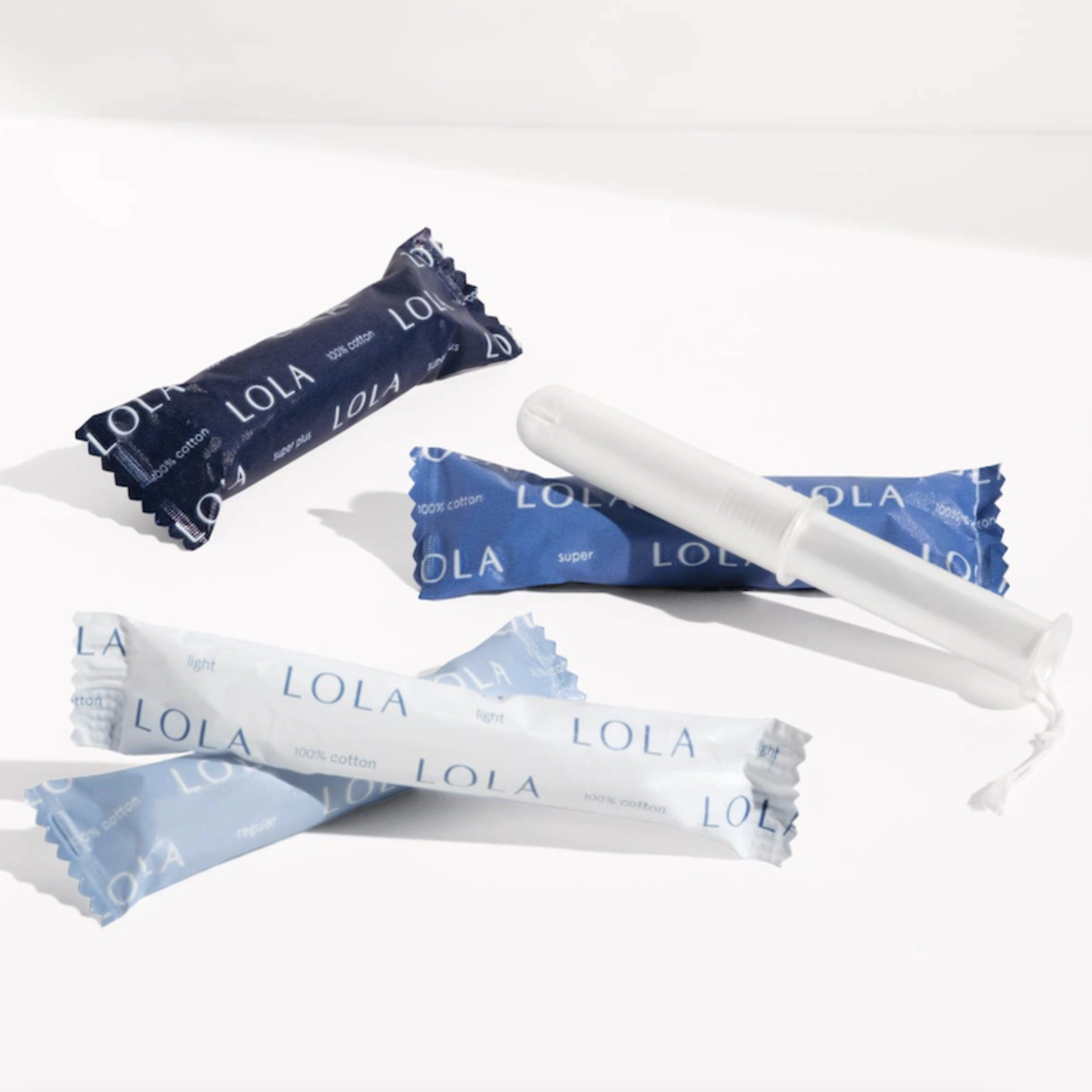
Many big-brand named companies offer a set absorbency mix in one box, most often all one absorbency. LOLA innovated the customizable box, allowing customization down to the single unit. I improved adoption of custom assortment with a number of changes, most notably the box builder and the ability to quick add a custom assortment from the product collection page.What were the barriers to customization?
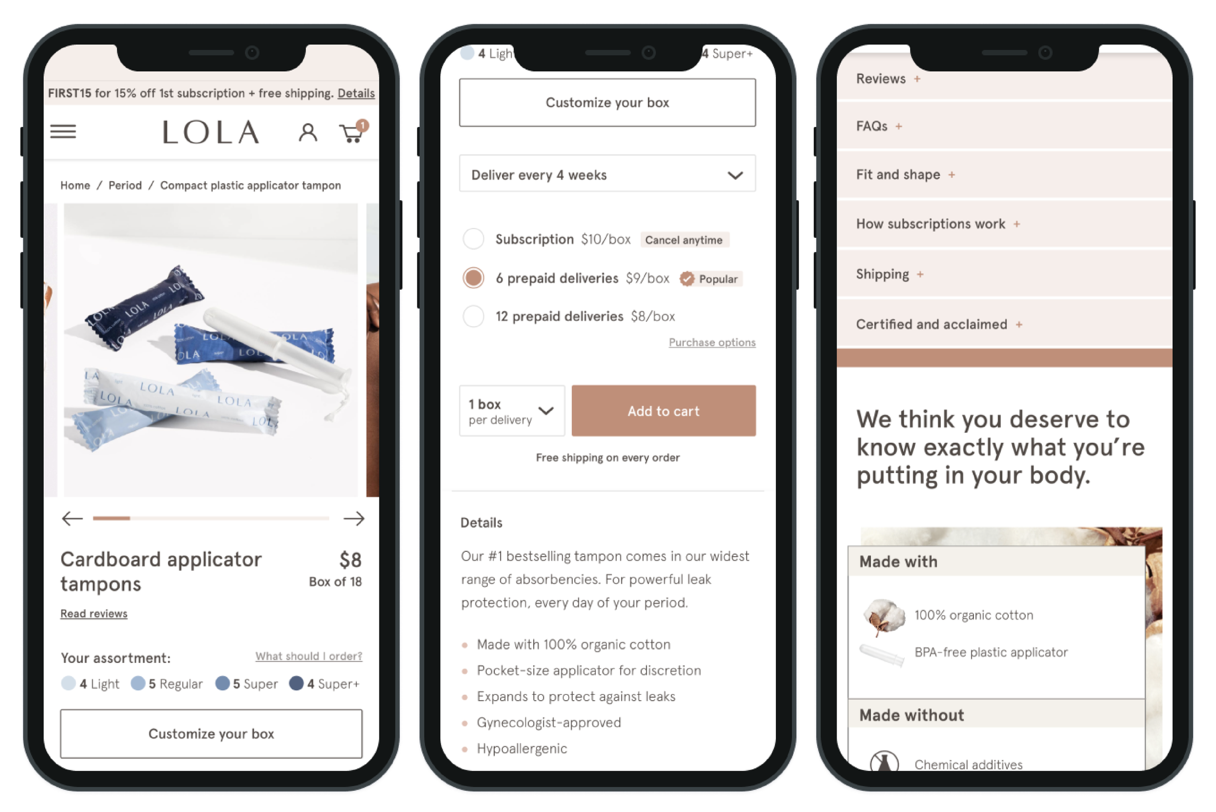
Our biggest barrier was educating the user on what absorbency mix she needed—since customization was a new option, we saw users take a lot of time determining what their box should contain. We found this out early in usability testing so I designed a “What should I order?” slide out on the product page which guided her purchase. Additionally, we defaulted the box builder feature to show the most popular product mix for each customizable product.How do you design a product page that works across all products?
LOLA’s product offerings are extremely diverse, not all products had customization, and not all products were subscription. I designed the product pages to be flexible and modular—many if-then instances. For example: IF a product is customizable, THEN place box builder above purchase options. We tested these modular blocks in usability testing for design and flow validation.How do you create a site for all points in the user journey?
I used persona work with support from both qualitative and quantitative data to design and iterate layout and messaging hierarchy along the consumer journey:Product page: For our curious consumer who needs a lot of validation prior to purchasing. We noticed FAQs were more clicked on than Reviews, so we’ve since moved FAQ’s above. As you scroll down the page the information gets more dense, the assumption being, if the user is searching for more detailed info, they will scroll deeper to find it.
Product collections page: For our “I know what I want and this is a cool brand” consumer who wants to purchase fast. Testing showed discrepancy in usability patterns between devices. On desktop users didn't care to read the features about the product, but on mobile, users did; so we built 2 different designs.
-
Unmoderated User Testing
I analyzed approximately 100 user tests over the course of this project, using TryMyUI and UserTesting.com. I tested design validation, design preference, usability, and competitor analysis. I wrote and evaluated my own tasks, ensuring the design was following both, global guidelines and expectations from our persona.
PDP with Custom Box Builder
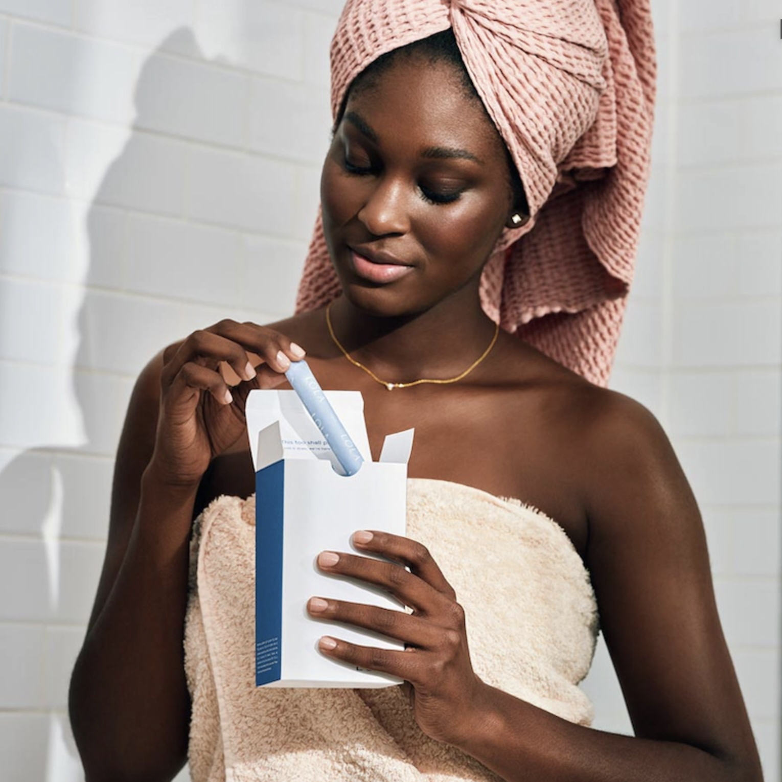
Beginning September 2019 we phased in changes to UI and UX. Aside from iterations of our current layout, our new feature would be the box builder—a visual representation of a customers period product order, indicating their specific absorbency mix .Additionally, after analysis of our existing product images I saw a huge gap in visual information. After collaboration with the creative producer and photographers, our product pages would have brand new images—every product would now have 5 images at minimum showcasing products at scale, in a lifestyle setting, and a moving gif showcasing how-to-use the product or highlighting an innovative feature. Post-launch we ran testing to make sure the images hit all objections and results proved positive:
"The images were great. They actually provided me exactly what I’m looking for with a product and not being completely to the edge with it. We know that these are personal things that we would use as a female, but to me, for the most part, I did appreciate the way images were displayed...and to complete it with a gif at the end was very helpful. That is exactly the type of visualization that I needed to buy a product."
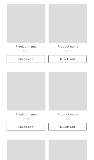
Quick Add
The product collection page was overhauled to meet our three main goals: (1) improve the mobile experience, the current design is laborious with tons of scrolling but little reward, (2) optimize SEO by adding relevant search terms to the page, and (3) encourage a quicker purchase path by giving users information faster.