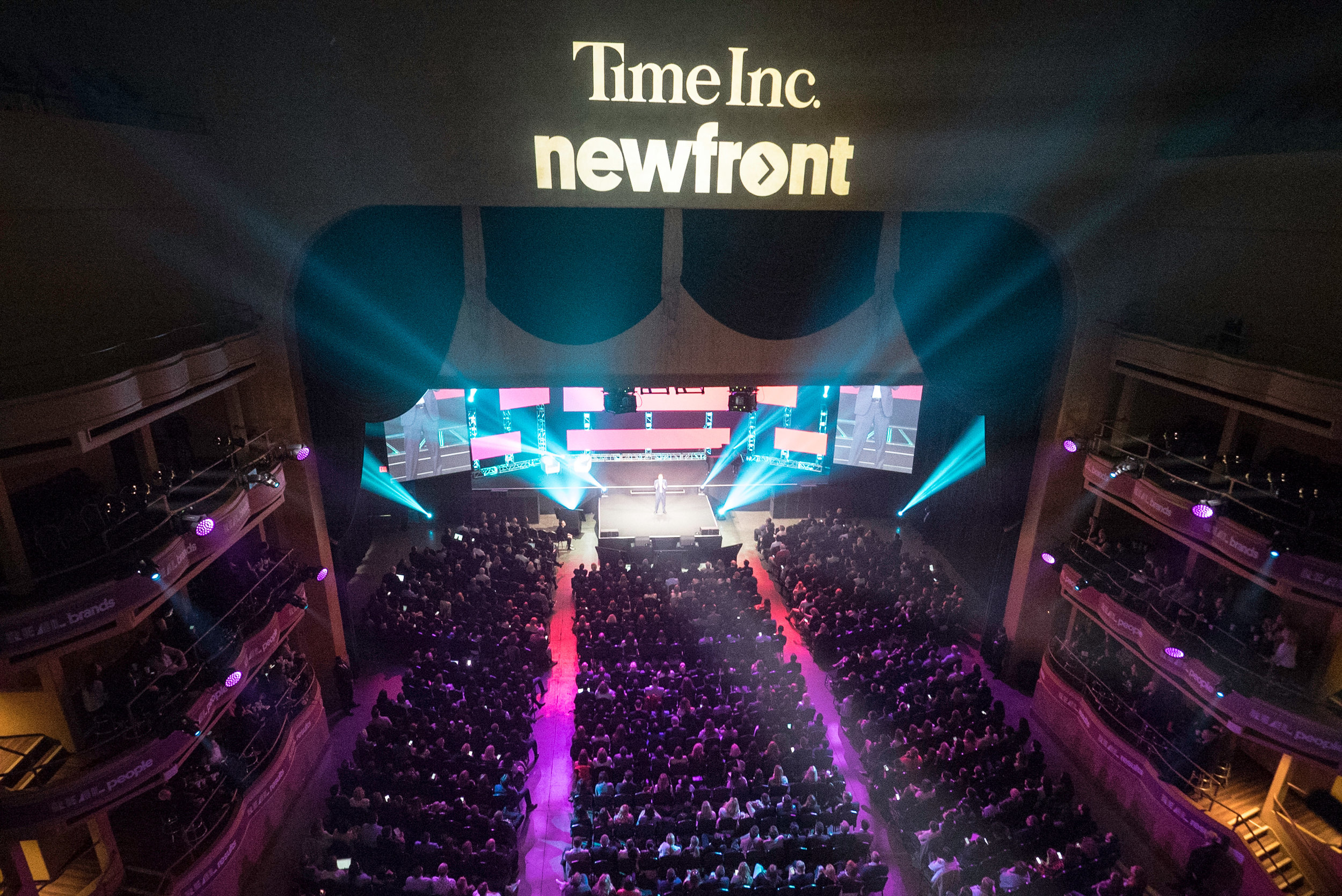
Time Inc. NewFront
The Challenge
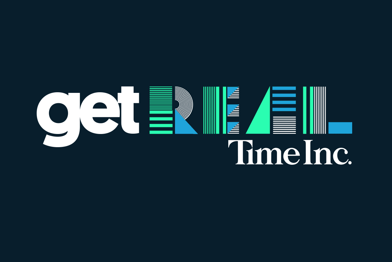
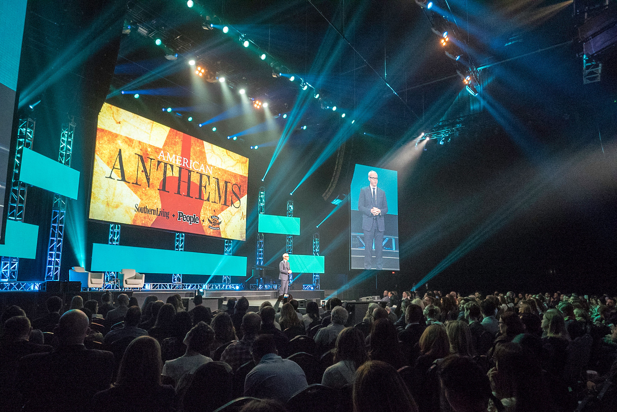
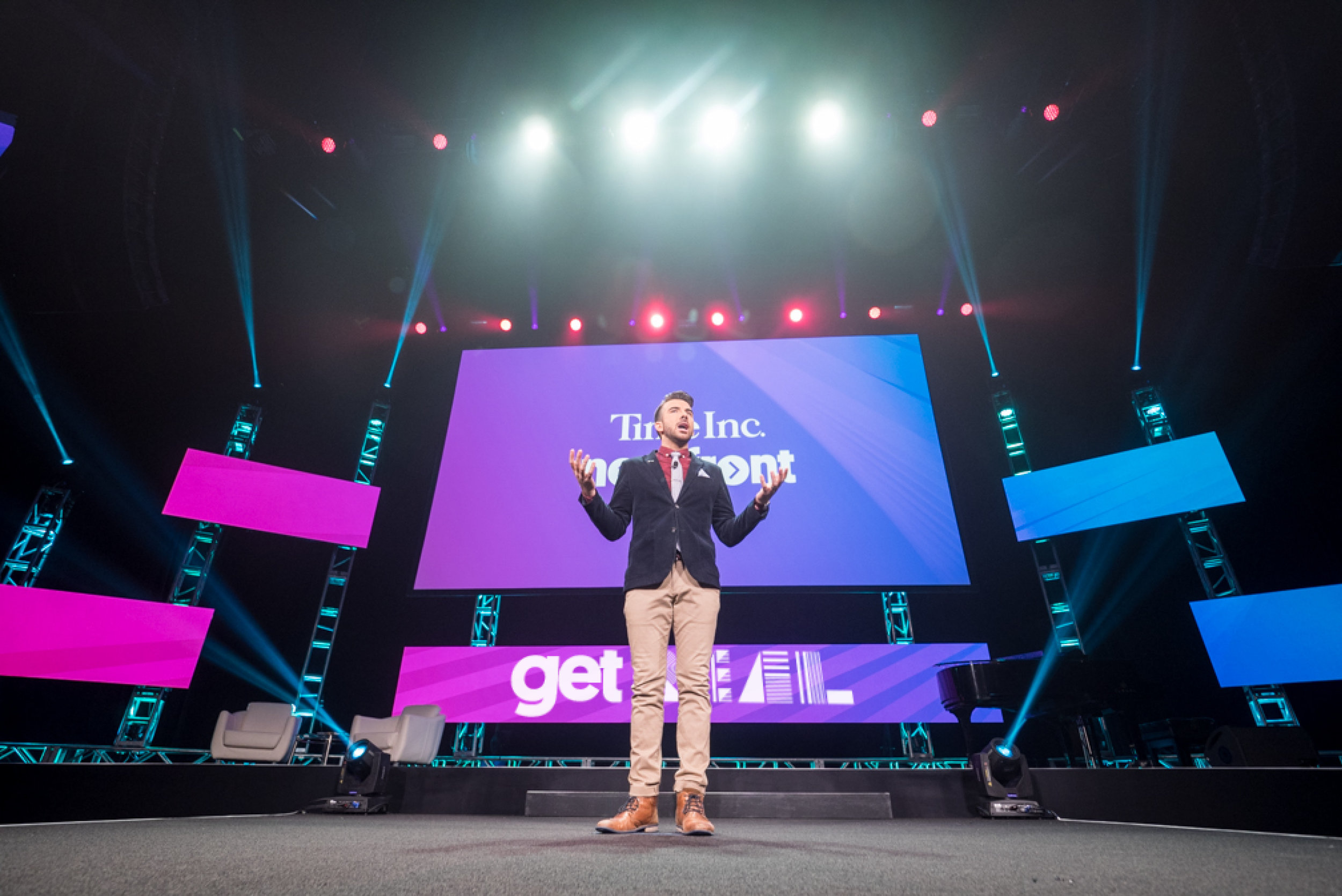
Time Inc. established a three pillar focus for the 2017 NewFronts: Get Real: Real Brands, Real People, Real Results. We took a direct shot at “fake news” with our trusted content and diverse portfolio. In the past year our video production and consumption has grown 100% year-over-year, it was our time to establish awareness and awe with our advertisers and media execs.
Deliverables
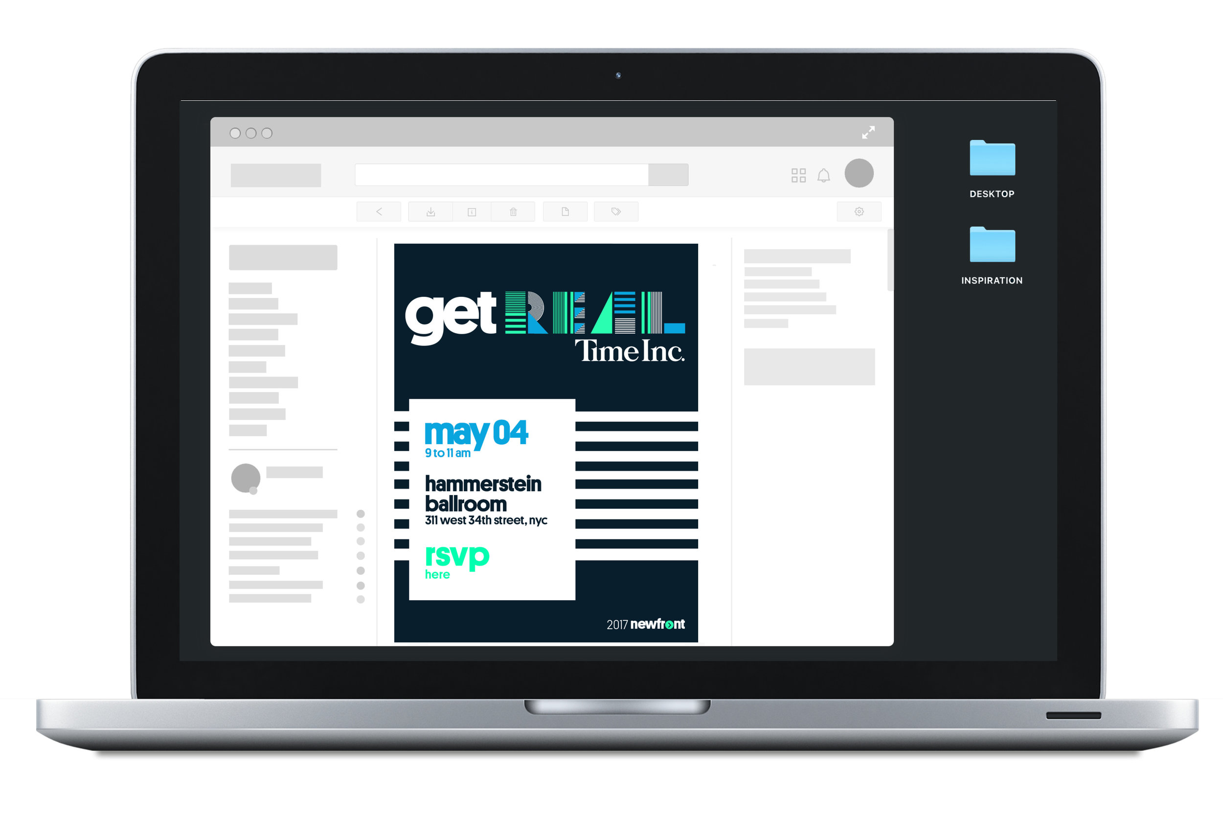
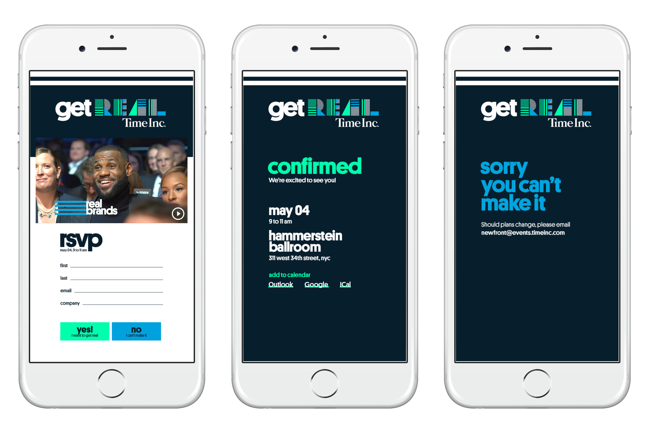
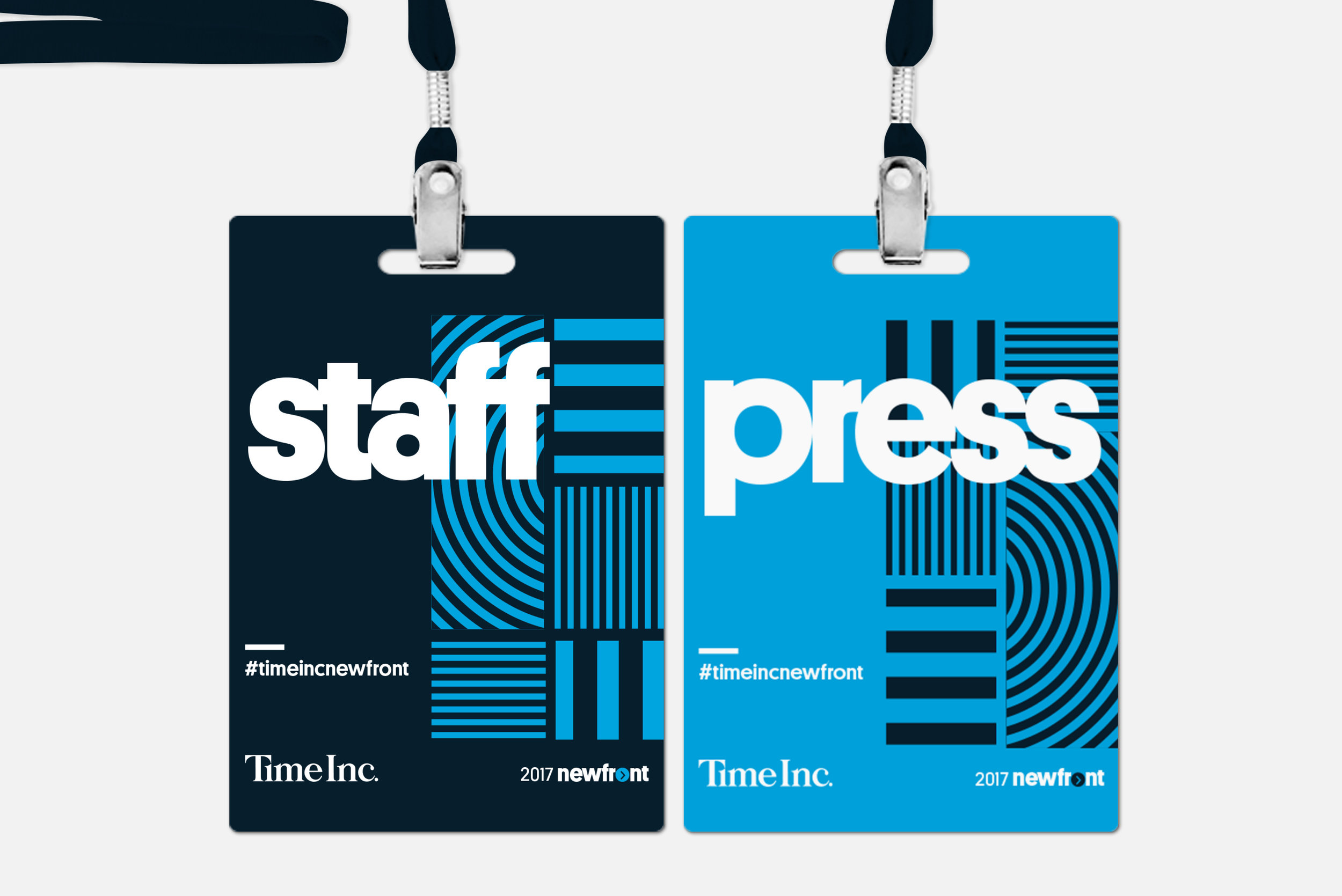
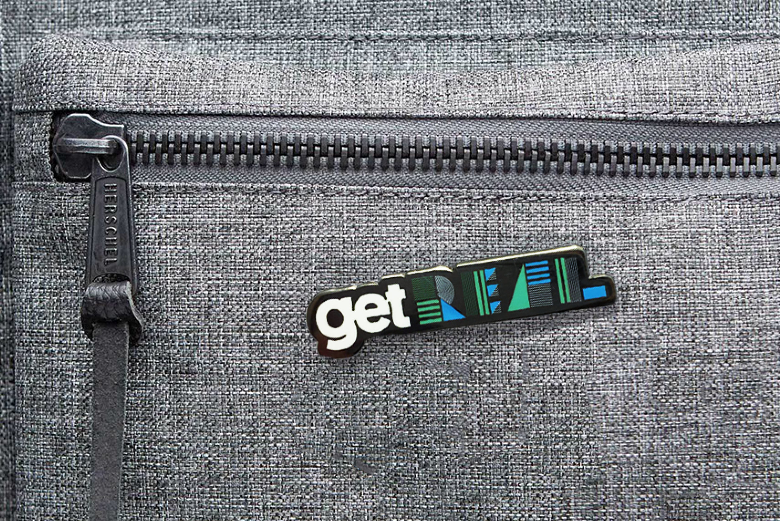
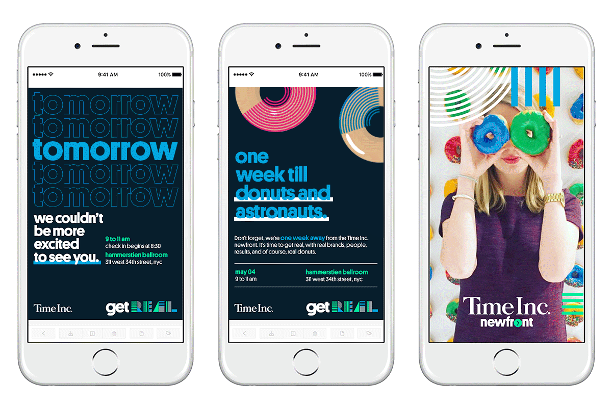
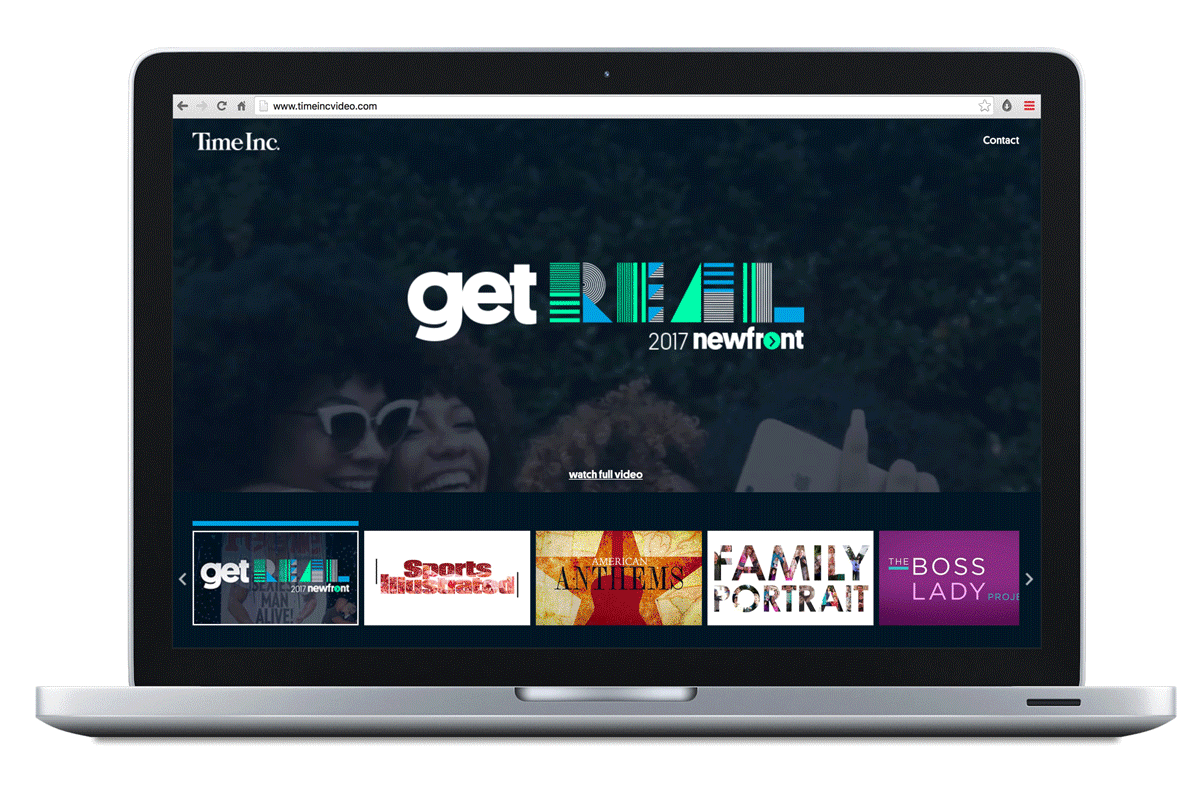
Design strategy and system, “get real” event logo, invite and email creative, lanyard and badges, swag pins, post event recap website *other deliverables such as presentations and step and repeats were created by other team members
KPIs
+ Increased awareness of Time Inc. brand video
+ Excited over 4K media executives in attendance
Team
Sarah Argus, Senior Designer
Melissa Harty, Creative Director
Ted Mauseth, Art Director
Louis Gubitosi, Web Director
Robert Boyd, Presentation Designer
-
Competitive Analysis
Time Inc. would be competing for attention against other UpFronts and NewFronts—events designed for media execs who are looking to partner and spend money tv and video. We were able to gather a few designed assets from past events, both competitors and from our own history. Our main priority was to stand apart from anything else.
Opportunity
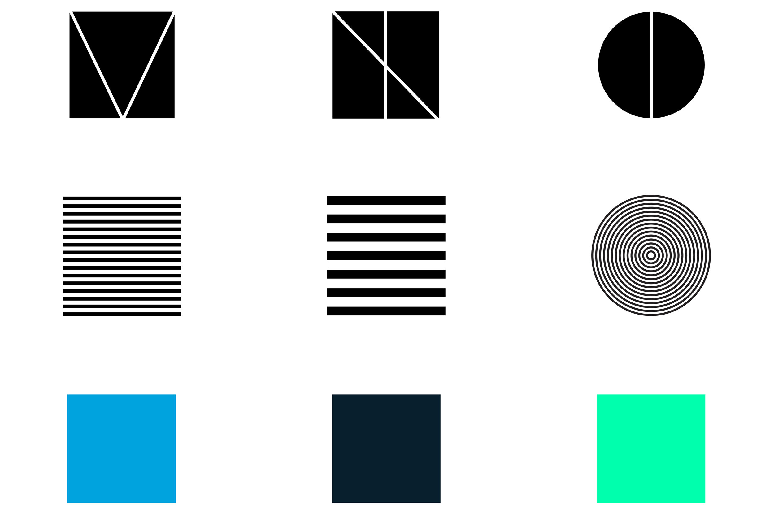
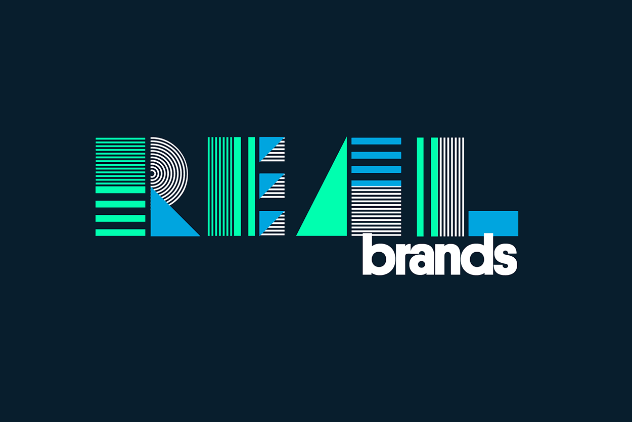
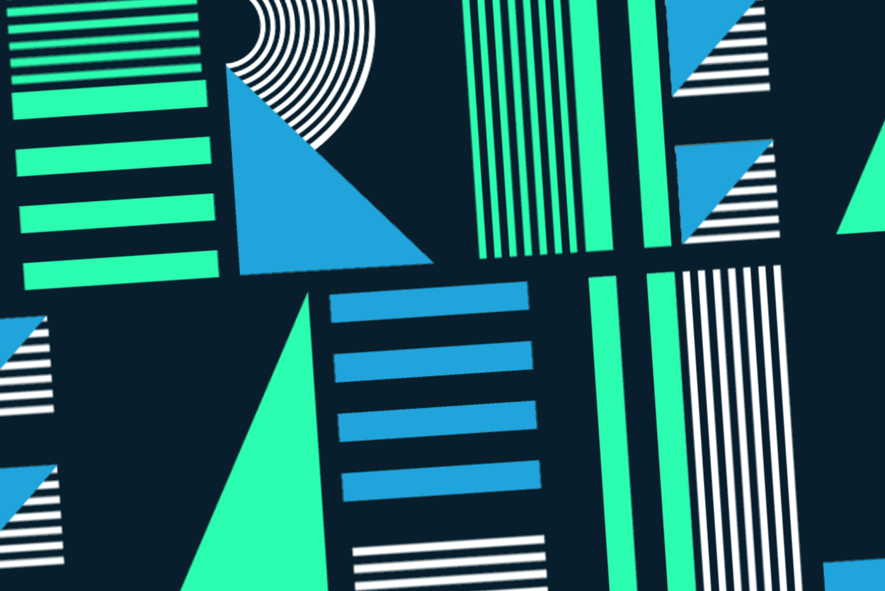
The concept of “get real” was created after Trump took a direct shot at news organizations, including TIME at broadcasting “fake news.” We saw an opportunity for 3 brand pillars—real people, brand, and results. From there I was able to craft a design system which mirrored this—3 colors, 3 shapes, 3 patterns. -
How does an event feel unified when multiple designers are responsible for separate assets.?
I ensured that the design system was large and flexible enough to conform across all collateral. Once the system was approved, I created examples for how it could work across digital, print, and experiential. Once these mocks were approved by the event runners, I met with all designers, both in-house and production crew to ensure everyone understood the bigger picture. Lastly, I was a stakeholder on all creative approvals.How does a traditional print media company allude to their digital and video prowess through branding?
Through subtle cues we tried to reenforce our digital-first mentality. For example, I unitized our 2 primary brand colors but added a neon, digital-only green. Additionally, we animated the logo where possible. Lastly, the design system was made to mirror a 1:1 pixel grid. -
Design Iteration
The design system and assets were created over the course of 3 months. During this time we created multiple versions which we tested internally (dog fooding). During internal critiques we compared new work against the rest of the approved collection to ensure consistency and unity.